Table Of Contents
- Disclaimer
- The Login Screen
- The Project Selection Screen
- Overview of Appli IDE Interface
- Tools palette
- Keyboard Shortcuts
- Screen Management
- Property Inspector
- Responsive Design
- Low-Code & Action Scripts
- Data Management
- Tutorial: Cool Coffee Shops
- Elements
- Element: Browser
- Element: Button
- Element: Camera
- Element: Create Account
- Element: Dropdown
- Element: Field
- Element: Graphic
- Element: Image
- Element: Layout
- Element: Login
- Element: Map
- Element: Radio Group
- Element: Search Field
- Element: Switch
- Element: Tab Menu
- Element: Table
- Element: Text
- Element: Media
- Element: Form
- Element: LineGraph
- Image Credits
Property Inspector
In Appli, one builds their app by creating and customizing elements on a screen. Each element has their own characteristics and behaviors. We refer to these characteristics as properties. To change them, the developer uses the property inspector in the right-side of the screen.
To view the properties of an element, select it using the pointer tool. Each type of element has properties that are suitable for them. For example, a map element will have a property to specify geolocation markers. The other elements have no need for such property. You won’t see it on them. Some properties such as labels and colors are quite common and you’ll find them over and over as you work in your app. All this will become second nature as the developer gets familiar with Appli.
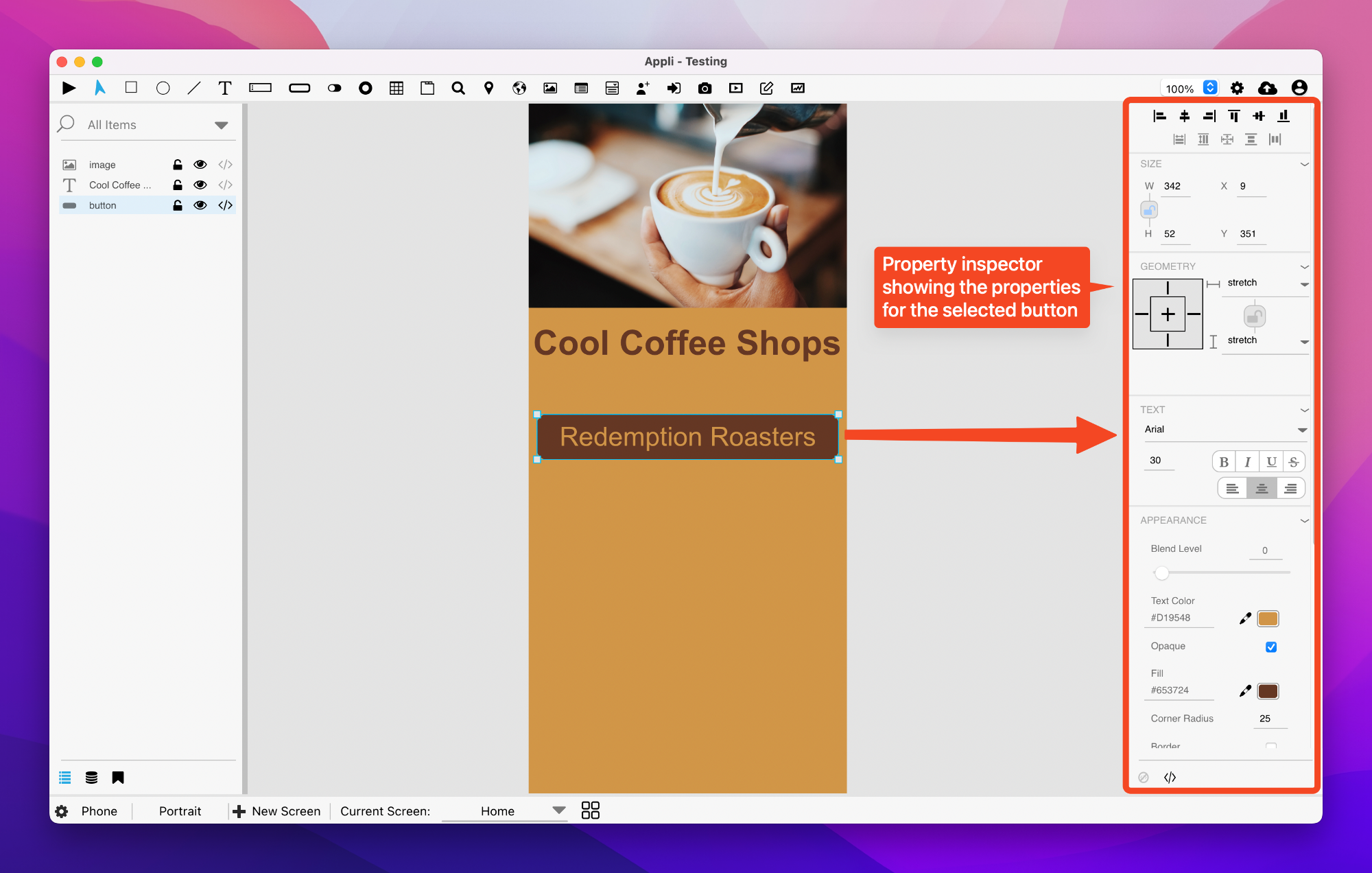
The interface of the property inspector is divided into sections that always appear in the same order regardless of the selected element’s type.
Alignment tools
Placed at the very top of the property inspector are the alignment tools.
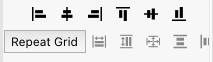
These tools help the developer align their elements on the screen. Use them when you want to align an element based on the screen borders or other elements.
Size properties
These are quick ways to change the position and dimensions of an element.
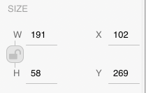
There is a handy padlock that enables you to lock the dimensions of an element so that you don’t resize them by accident.
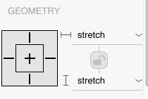
Geometry properties
There are many variations of screen size and resolution for each platform when we factor in the thousands of devices that exist out in the world. A good example is smartphones. They come in various sizes and aspect ratios, even though most of them still qualify for a portrait smartphone category.
The geometry properties let the developer configure how an element should behave when the screen size differs from the one being used to design the application. Elements can grow, shrink, etc. To learn more about how to craft resolution independent screens, head on to the responsive design documentation.
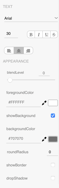
Text and appearance
These represent all the properties that govern the appearance of an element. Colors, graphic effects, shadows, labels, all are a part of this text and appearances section. Be aware that these can vary depending on the kind of element selected. For example, elements without text will not contain a text section.
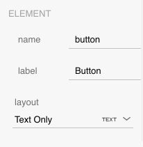
Element specific
The properties that are specific for the type of element selected are displayed in a element specific section. To learn more about the properties of each kind of element, check out the element gallery.
No-code and low-code

These are small buttons at the end of the panel. Some properties can’t fit well in a sidebar like this, so you can access them using these buttons.
Some elements are very complex, such as the camera element, to access things such as the camera output, use the first button, which is the no-code button.
The low-code button is used to configure flows. These are the behaviors attached to an element. You can learn more about them by reading the documentation on flows and behaviors.