Table Of Contents
- Disclaimer
- The Login Screen
- The Project Selection Screen
- Overview of Appli IDE Interface
- Tools palette
- Keyboard Shortcuts
- Screen Management
- Property Inspector
- Responsive Design
- Low-Code & Action Scripts
- Data Management
- Tutorial: Cool Coffee Shops
- Elements
- Element: Browser
- Element: Button
- Element: Camera
- Element: Create Account
- Element: Dropdown
- Element: Field
- Element: Graphic
- Element: Image
- Element: Layout
- Element: Login
- Element: Map
- Element: Radio Group
- Element: Search Field
- Element: Switch
- Element: Tab Menu
- Element: Table
- Element: Text
- Element: Media
- Element: Form
- Element: LineGraph
- Image Credits
Responsive Design
Computing devices come in various form-factors — from desktop computers to small smartphones — being to adapt and serve your customer is a crucial feature for any application.
No one wants to use an application that was designed for a smartphone and presents itself with the same smartphone-focused user interface on the desktop or tablet. The reverse is also true, an application designed for a desktop is usually a poor citizen on a small smartphone.
Responsive design is the technique of creating designs that adapt to run well in device.
To achieve that, Appli uses three broad platform categories: desktops, tablets, and mobiles. Your design for each of those categories is independent from the others.
Even with per-platform designs, one might worry that many devices in a single category are still too different from one another. While that is definitely true, the properties in the geometry section of an element allow the developer to set how the element adapts to different screen sizes. Mobile phones might come in different resolutions and proportions, but they’re all just phones: one screen that you interact using touches. Desktops and laptops have different screen sizes, and you mostly interact with them using keyboard and mouse. Tablets sit in between them both and deserve a special design that leverages the best of both worlds.
In this chapter, we’re going to learn how to create independent designs for each platform and how to make effective usage of the geometry-related properties to make sure our application shines in all devices.
Creating designs for each platform
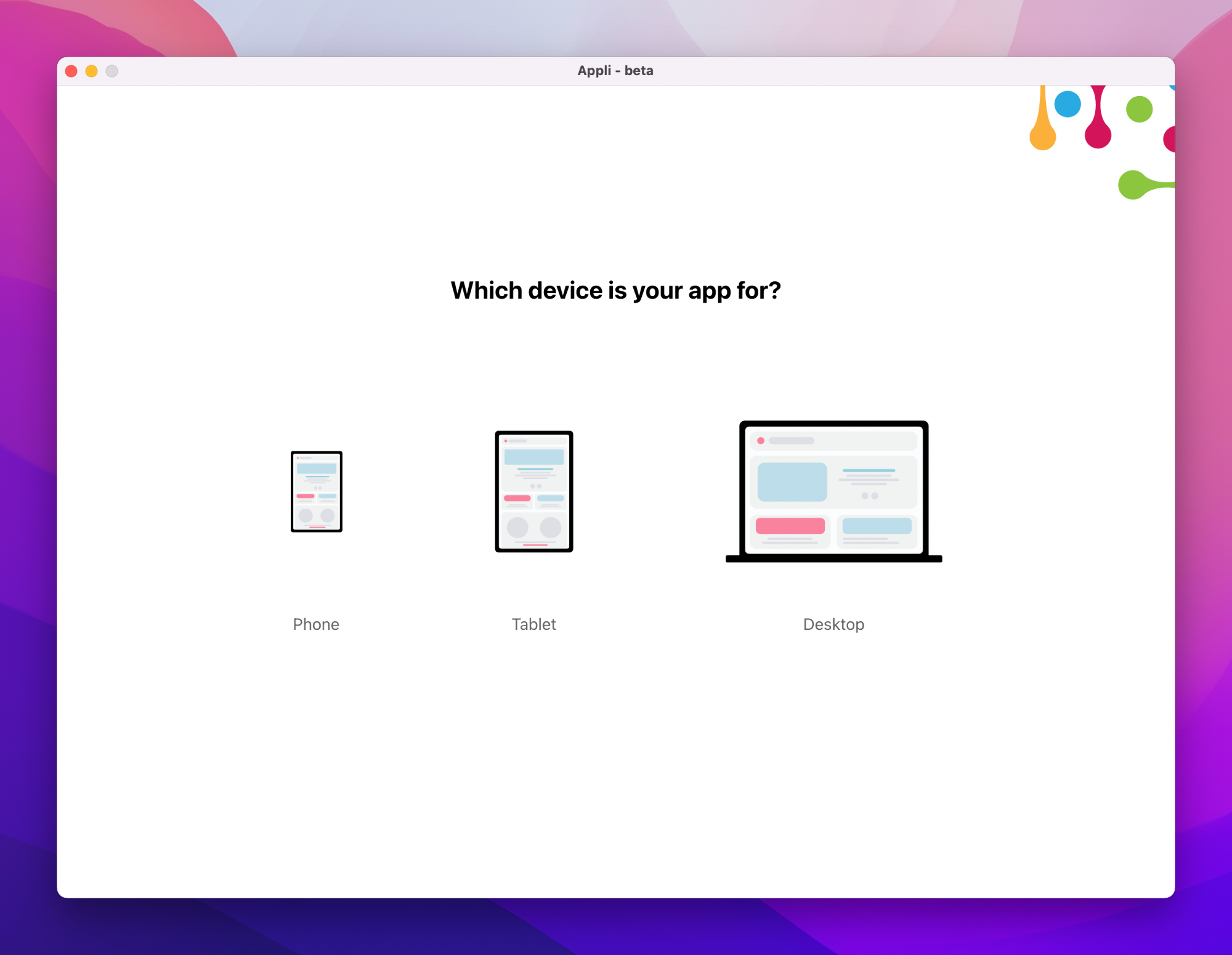
When you are creating a new application, you need to choose the device category you want to work with. Do that by clicking on the desired device on the platform selection screen_:
Once you complete your application for that category, you can add additional applications with different platforms to your project. If you need to change the currently selected platform, use the button in the footer open the Platform Setup dialog.
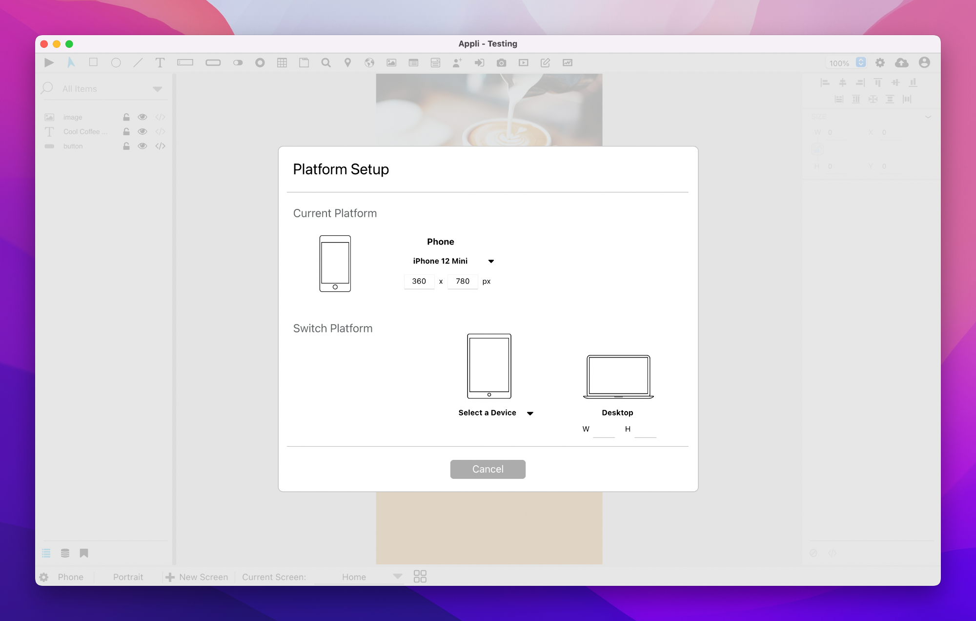
Be aware that tablets and mobile applications can adapt to orientation changes. Use the orientation toggle at the footer next to the platform indicator to switch between portrait and landscape. Each orientation design is independent from the other.
Understanding the geometry properties
Besides creating new designs for each combination of platform and orientation, one should use the properties inside the geometry section to configure how an element should behave when the screen does not match the resolution that was used for the original design of the application. A typical case is when you design a mobile app for an iPhone and open it on a Samsung Galaxy Note. They are both phones, but they have different proportions and screen resolutions.
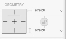
There are two settings: responsive-x and responsive-y. They are used to configure how the element behaves when there are changes to the width and the height of the screen.
The possible values for responsive-x are:
- left: move element to maintain its distance to the left side of the screen.
- right: move element to maintain its distance to the right side of the screen.
- left and right: same as having both left and right set.
- stretch: grow or shrink the element as needed.
- center: don’t resize the element but center it considering the changes to the screen width.
The values for responsive-y are:
- top: move element to maintain its original distance from the top of the screen.
- bottom: move element and maintain its original distance from the bottom of the screen.
- top and bottom: the same as setting both values above.
- stretch: grow or shrink the element as needed.
- center: don’t resize the element but center it vertically considering the changes to the screen height.
The values can be changed using the dropdown menus on the section. The visual guide next to them show the current selection and can also be used to change the value for those properties, just click on the corresponding line.
Stretch is the default value used for all elements. It means that the object will grow or shrink to cope with the changes in width and height while preserving its aspect ratio.
To make it easier to visualise how these values change how an element behaves, consider the screen below. It was designed for the iPhone XR inside Appli.
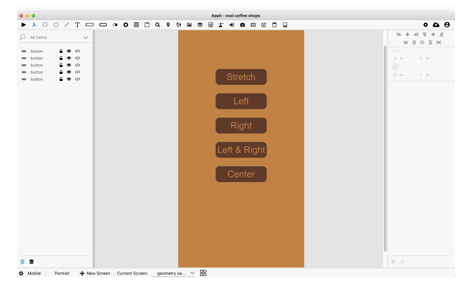
Notice how all button have the same size. The label of each button represents the value of the responsive-x property. Once I open it in Appli player using a different phone, in this case an iPhone 12 Mini, look how each button changes according to their responsive-x property.
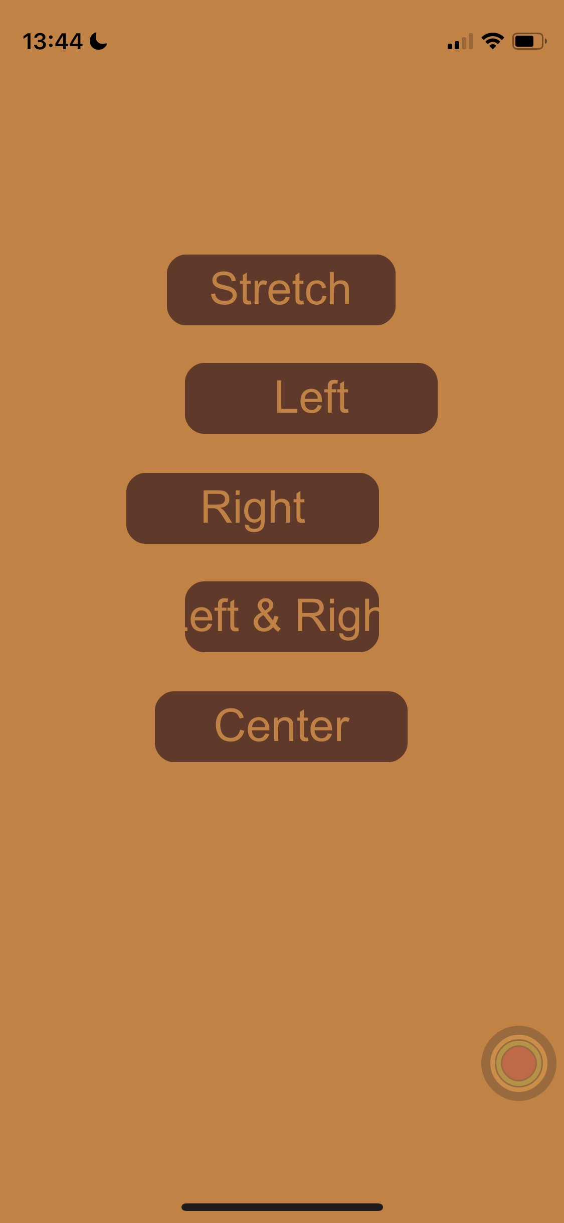
As you can see, the default behaviour which is using stretch is the best option. With Appli, you get responsive design by default and you only need to change something when you have niche needs.
Oh, and in case you’re wondering how their vertical position worked out of the box, that is because they’re all have responsive-y set to stretch.
Tips and Tricks
- When designing a user interface consider what kind of input method your user will be using. A finger is less precise than a mouse, so larger buttons make for easier targets in mobile platforms while smaller buttons allow you to make the best use of screen real estate on a desktop platform.
- When in doubt, set it to
stretch. - All tablet users have access can use touch input. Some of them might have keyboards or even a mouse connected to their tablet. Make sure your tablet design can work with just touch, but make sure that users leveraging keyboards and mouse will benefit from them.