
Table Of Contents
- Disclaimer
- The Login Screen
- The Project Selection Screen
- Overview of Appli IDE Interface
- Tools palette
- Keyboard Shortcuts
- Screen Management
- Property Inspector
- Responsive Design
- Low-Code & Action Scripts
- Data Management
- Tutorial: Cool Coffee Shops
- Elements
- Element: Browser
- Element: Button
- Element: Camera
- Element: Create Account
- Element: Dropdown
- Element: Field
- Element: Graphic
- Element: Image
- Element: Layout
- Element: Login
- Element: Map
- Element: Radio Group
- Element: Search Field
- Element: Switch
- Element: Tab Menu
- Element: Table
- Element: Text
- Element: Media
- Element: Form
- Element: LineGraph
- Image Credits
Overview of Appli IDE Interface
Welcome to the primary interface of Appli IDE. This is where you’ll spend most of your time as a developer working on your next awesome project. This section will help you become familiar with the various features and workflows inside the playground.
The playground screen is divided into five regions: tools palette, project browser, playground, property inspector, and footer. In the next sections, we’ll provide a high-level overview of each of these regions with links to dive deeper into each of them.
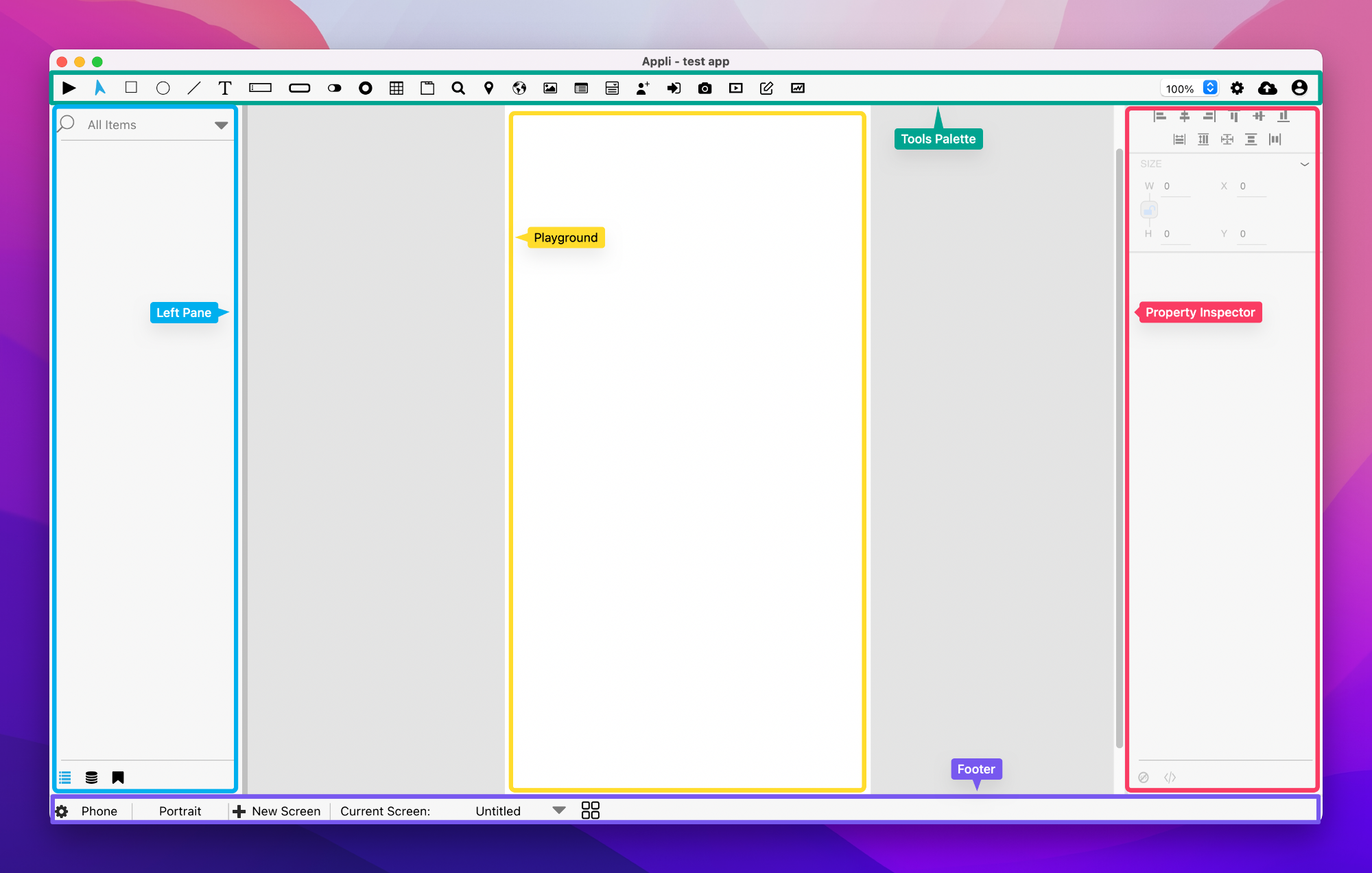
Tools Palette
The tools palette on the top of the interface holds the elements that the developer uses to build their own application. To add an element to the playground, first select the element, and then use the mouse to create it by clicking and dragging a rectangle that represents its dimensions on the playground.
On the right side of the tools palette is a collection of buttons to enable to you to:
- Save your project to the cloud.
- Change application-wide settings.
- Handle workflow related tasks such as signing out, going back to the home screen,.
To learn more about which elements are available for you, check out the elements gallery.
Check out the Tools Palette documentation to learn more about the tools palette itself.
Playground
The playground is the most important region in the Appli IDE interface, which is why we call this screen the playground screen. This is the canvas in which the developer will build their application.
The Left Pane
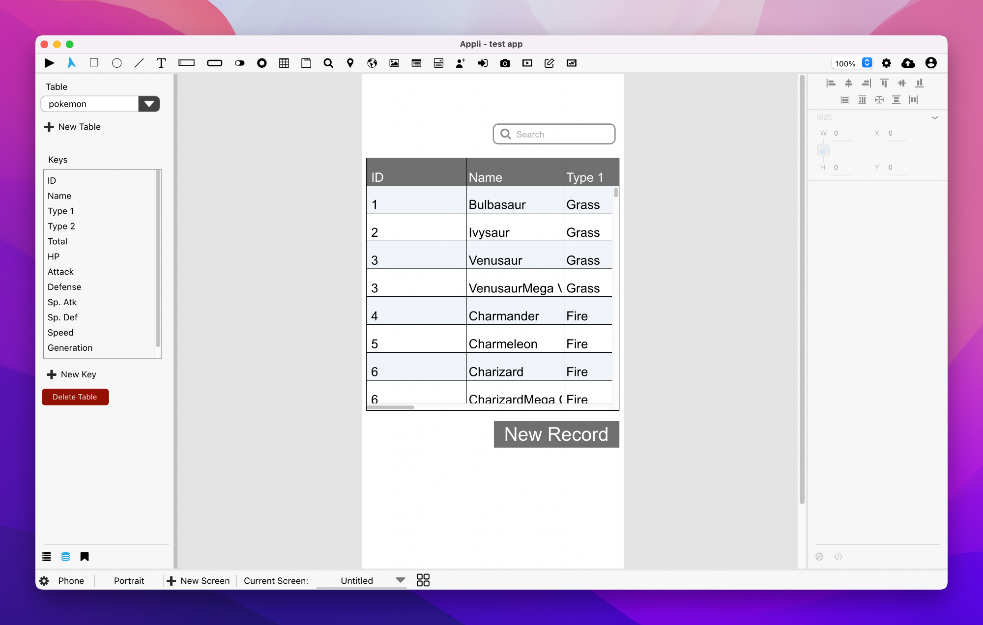
The left side of the IDE hosts three important tools: the project browser, the data manager, and the asset manager. To switch between them, use the buttons at the bottom of the pane. The first button switches to the project browser, the second selects the data manager, and the last one activates the asset manager.
Project Browser
The project browser lists all the elements on the current screen as a hierarchical list. Some elements are containers. In such cases, the elements they contain will appear under them on the list.
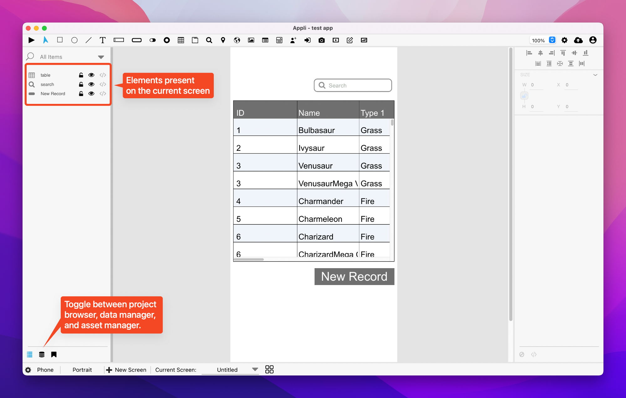
A search box is provided in case you need to filter the list of elements. For each element on the list, you can:
- Use the padlock button to lock the element and prevent accidental changes to its properties.
- Use the eye button to toggle the visibility of the element.
- Use the brackets button to change the low-code/no-code flow for the element.
Data Manager
The data manager is used to add and configure data tables for your application.
Tables can be local, cloud, or hybrid. The developer can decide which keys are exposed to the application and many other features. Dive deeper by reading the data management documentation.
Asset Manager
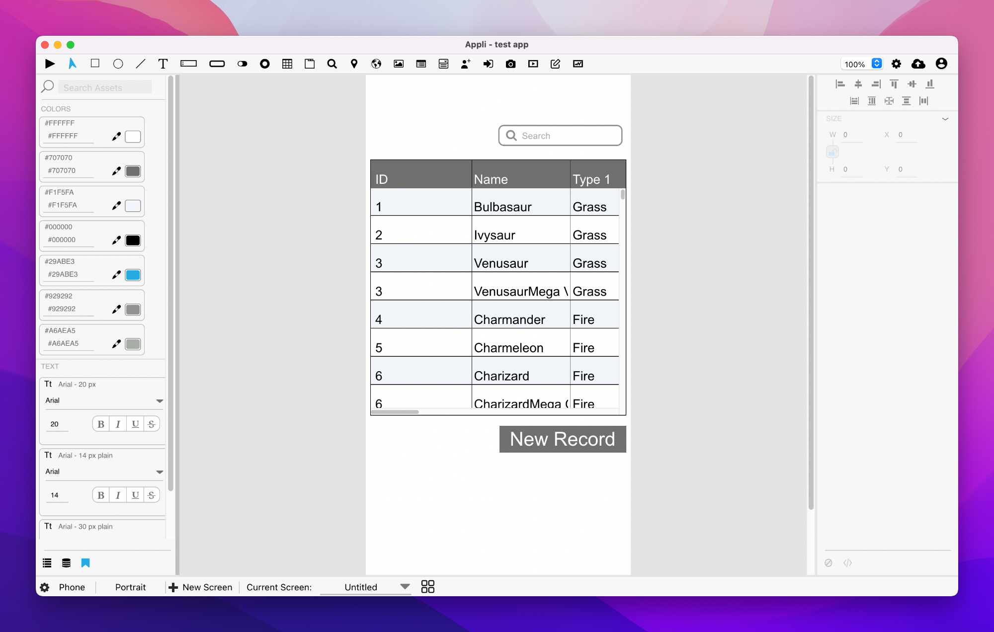
Use the asset manager to define a theme for your application. You can select default colors and text styles that will apply to all elements in the app.
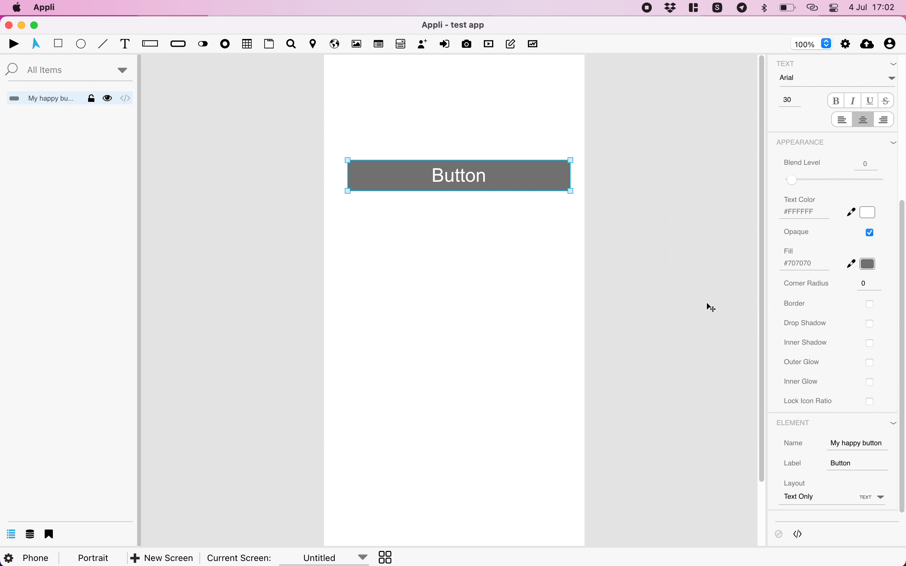
Property Inspector
On the right side of the IDE, you’ll find the property inspector. Elements are configurable via properties. You can change various characteristics and features by changing values in the property inspector. It is through the property inspector that the developer can change the behavior of an element, something that you can learn more by diving deeper into the property inspector.
Footer
The footer is at the bottom of the interface. In that region are all the features related to managing the various screens and platforms in your project.
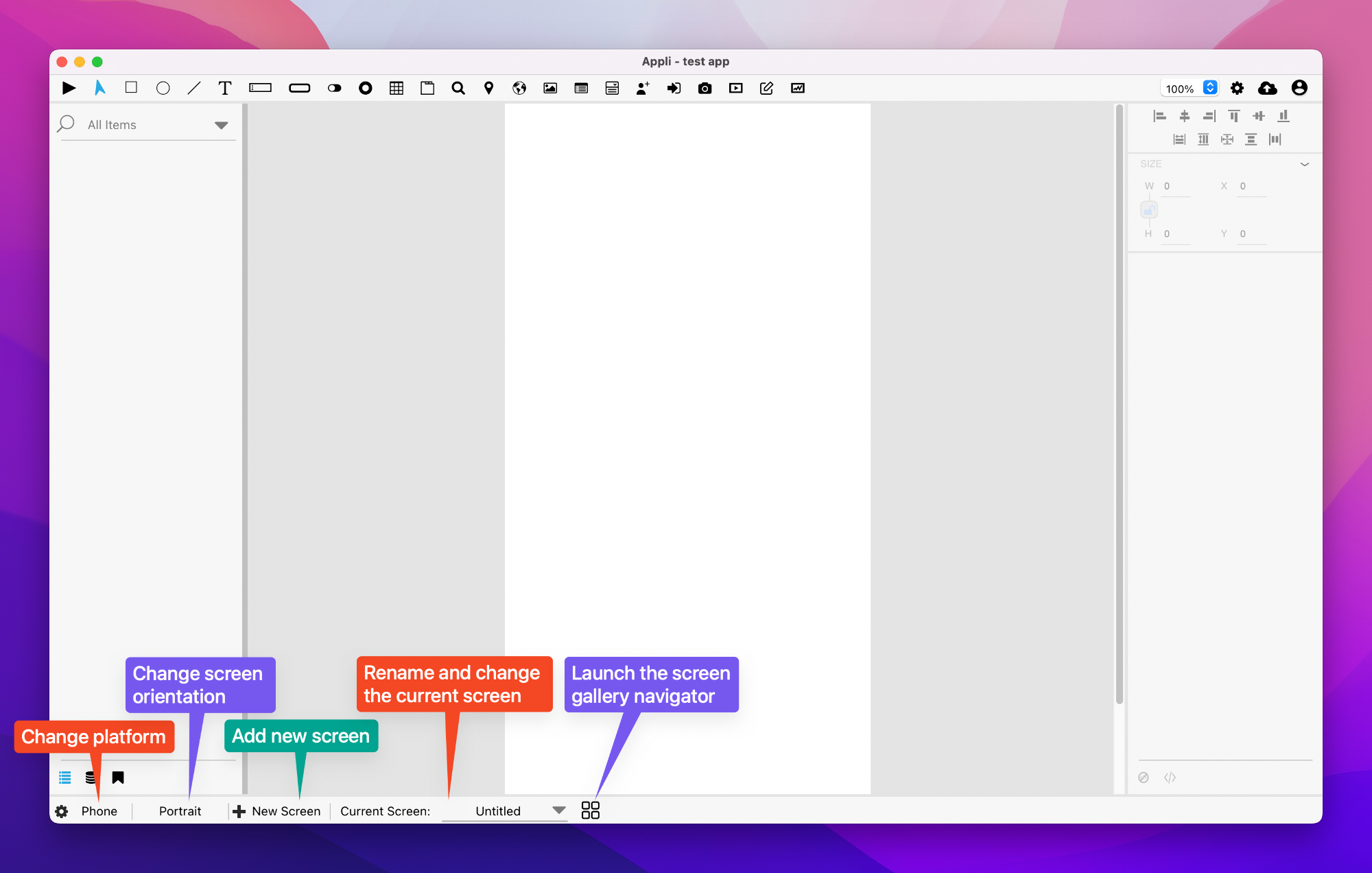
Read the screen management documentation to learn how to create and manage multiple screens.