Table Of Contents
- Disclaimer
- The Login Screen
- The Project Selection Screen
- Overview of Appli IDE Interface
- Tools palette
- Keyboard Shortcuts
- Screen Management
- Property Inspector
- Responsive Design
- Low-Code & Action Scripts
- Data Management
- Tutorial: Cool Coffee Shops
- Elements
- Element: Browser
- Element: Button
- Element: Camera
- Element: Create Account
- Element: Dropdown
- Element: Field
- Element: Graphic
- Element: Image
- Element: Layout
- Element: Login
- Element: Map
- Element: Radio Group
- Element: Search Field
- Element: Switch
- Element: Tab Menu
- Element: Table
- Element: Text
- Element: Media
- Element: Form
- Element: LineGraph
- Image Credits
Screen Management
A project can contain multiple apps, one per platform. Each app can contain multiple screens in different orientations. That is a mouthful to say that an Appli project is very flexible. You can build apps for various platforms — desktop, tablets, and smartphones — in a single project, and each app will have their own screens.
Creating a new screen
When you first create a project and an app, you select an initial platform and orientation for the app. The playground screen will open with that platform and screen selected. As your project grows, you’ll may need to add more screens. The controls to do that are at the footer.
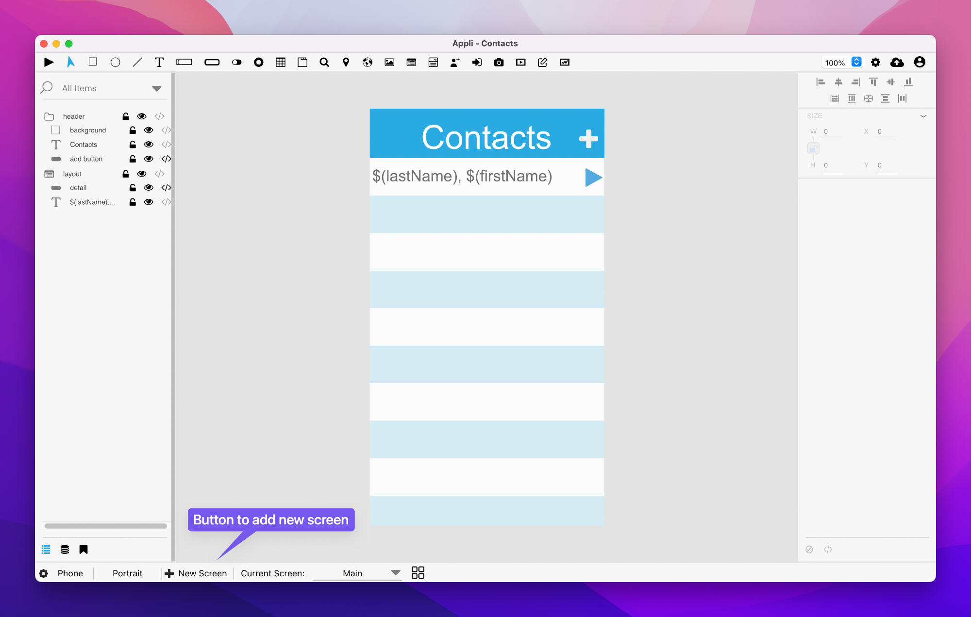
After clicking that button, Appli will ask for the name for this new screen. The playground will automatically switch to the newly created screen as shown in the current screen display in the footer. That display is a pop-up menu that allows the developer to switch between the screens in the current platform.
Switching between screens
Besides the pop-up menu shown above, there is another control that opens a gallery of screens thumbnails that makes it easier to find the screen you want.
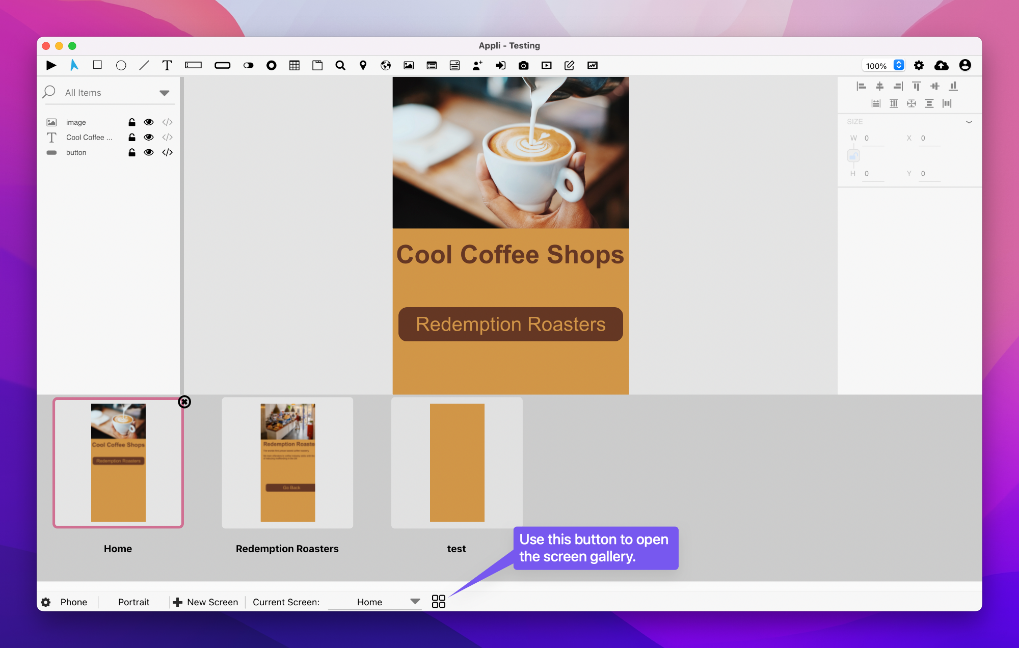
Important: It is in this gallery view that you can delete a screen. Use the little crossed circle button in the corner of the current screen thumbnail to delete it.
Changing orientation
Each screen can have independent versions for each orientation. You can switch between them by using the orientation button on the footer. Both orientations are versions of the same screen and the player will select the correct when it comes time to run the app later.
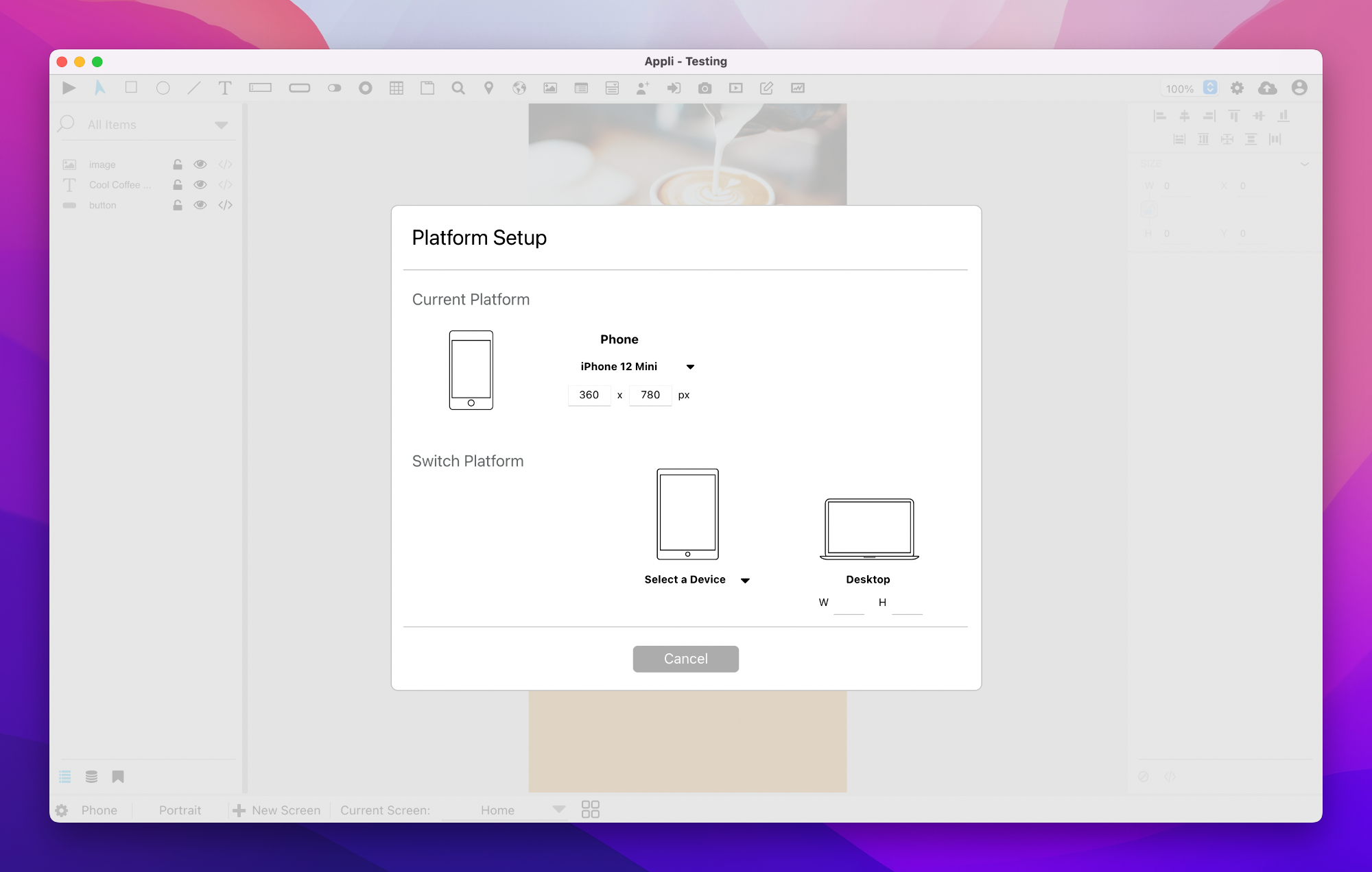
Platform management
The first button in the footer is used for changing the app platform. Clicking it will display the information about the current platform, and also allow the developer to switch to a new platform.
Final remarks & What to read next
As we have shown, all the controls to manage both screens and platforms are at the footer. By now, you should be able to:
- Create new screens.
- Create versions of a screen for different orientations
- Switch to a new platform.
- Switch between screens.
Even though you can create as many screens as you want, you still need to learn about responsive design to make sure that your screens can adapt to different resolutions. A screen that was designed for an iPhone 13 Pro Max might not be suitable for a smaller Android device. Using responsive design, you can configure elements to adapt to different resolutions and make sure your app always looks perfect.