Element: Text
This element contains non-editable text.
Text Setup
The contents of a text element can be set from a database record. Use the no-code interface to select the table and recordID used for the text element.
Actions
These are the low code actions available for text elements.
Format The Text
This action can be used to format the text. The current available format is USD Currency. The formatted text can be placed in a variable or inside an element.
Events
Text elements have a mouseUp event that can be configured using low-code. This event is triggered when the user clicks or touches the element.
Properties
Text Section
The properties in this section are used together with those in the appearance section to configure how the element is displayed on the screen. This section deals with the properties related to text used by the text.
| Property | Description |
|---|---|
| textSize | The text size used in the element’s text. |
| textFont | The font used in the element’s text. |
| textAlign | The text alignment used for the element’s text. It can be aligned to the left, right, or center. |
| textStyle | The style used in the element’s text. It can be bold, italic, underlined, and strikethrough. |
| sizing | sets the sizing of the element. |
Geometry Section
Use the properties in this section to configure the responsive design behaviors for the element.
| Property | Description |
|---|---|
| responsive | sets if the element size should be responsive. |
| responsiveX | how the element resizes responding to screen changes in the X axis. |
| responsiveY | how the element resizes responding to screen changes in the Y axis. |
| lockResponsiveAspectRatio | Locks the aspect ratio of the element. |
| allowUnderNotch | Stretch to fill notch |
| responsiveText | Responsive Text Size |
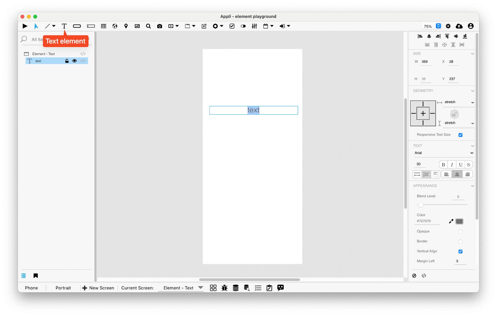
Size Section
This section is used to configure the text size and position.
| Property | Description |
|---|---|
| width | The value in pixels representing the distance between the left side of the element and its right side. |
| left | The value in pixels representing how distant element is from the left side of the window. |
| height | The value in pixels representing the distance between the bottom side of the element and its top side. |
| top | The value in pixels representing how far the element is from the top of the window. |
| lockAspectRatio | Locks the aspect ratio of the element. |
Appearance Section
This section is used to configure how the text looks.
| Property | Description |
|---|---|
| blendLevel | How transparent the element is. |
| foregroundColor | The color used in text. |
| opaque | if the element is opaque or if it’s background is transparent. |
| backgroundColor | The color used for the element’s background. |
| showBorder | Turns the visibility of the element’s borders on or off. |
| lineSize | the size of a line in pixels. |
| borderColor | the color used for the border of the element. |
| wrap | Toggles text wrapping. |
| truncateWithEllipsis | truncates the text and places an ellipsis character at the end. |
| showScrollbar | If the scrollbar should be visible or not. |
| verticalAlign | if the element should be aligned vertically. |
| bottomMargin | the value in pixels of the bottom margin. |
| leftMargin | the value in pixels for the left margin. |
| rightMargin | the value in pixels for the right margin. |
| fixedLineHeight | if the element should use a fixed line height. |
| textHeight | the line height in pixels. |
| useHTMLText | Render as HTML |
Element Section
This section is contains properties that are specific to elements of type text.
| Property | Description |
|---|---|
| name | The name of the element. Displayed in the project browser. |
This chapter was last updated on Fri 8 May 2026 15:20:15 BST