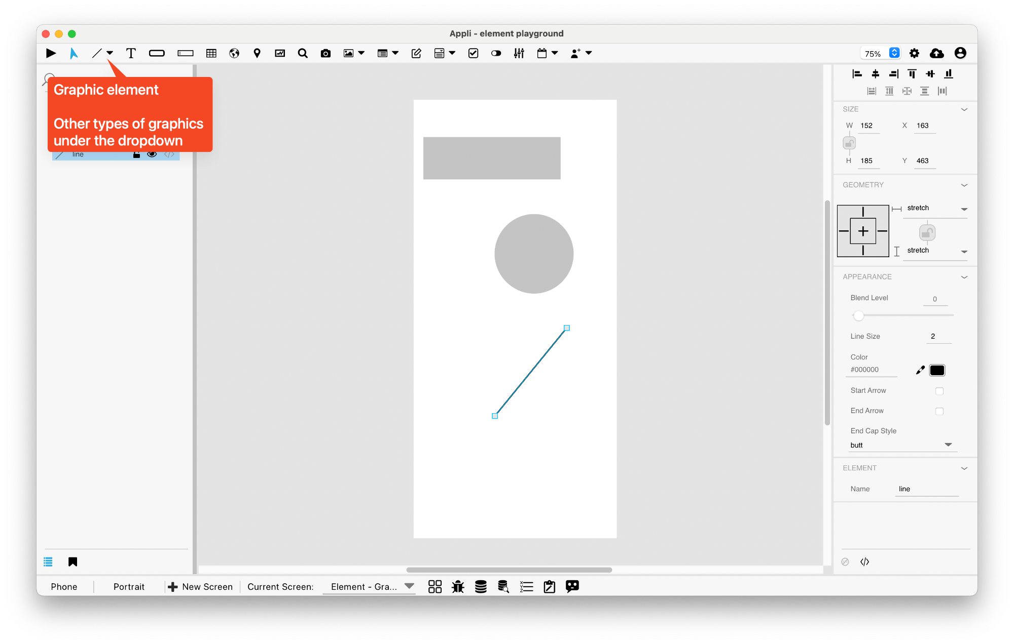
Element: Graphic
This element represents a graphic on the screen. Appli has distinct controls on the toolbar to make the most common graphics: rectangles, ellipses, and lines.

Events
Graphics have a mouseUp event that can be configured using low-code. This event is triggered when the user clicks or touches the graphic.
Properties
Size Section
This section is used to configure the graphic size and position.
| Property | Description |
|---|---|
| top | The value in pixels representing how far the element is from the top of the window. |
| left | The value in pixels representing how distant element is from the left side of the window. |
| width | The value in pixels representing the distance between the left side of the element and its right side. |
| height | The value in pixels representing the distance between the bottom side of the element and its top side. |
Geometry Section
Use the properties in this section to configure the responsive design behaviors for the element.
| Property | Description |
|---|---|
| lockAspectRatio | Locks the aspect ratio of the element. |
| responsiveX | how the element resizes responding to screen changes in the X axis. |
| responsiveY | how the element resizes responding to screen changes in the Y axis. |
| allowUnderNotch | Stretch to fill notch |
Appearance Section
This section is used to configure how the graphic looks.
| Property | Description |
|---|---|
| blendLevel | How transparent the element is. |
| opaque | if the element is opaque or if it’s background is transparent. |
| foregroundColor | The color used in text. |
| showBackground | If the element background should be opaque or transparent. |
| backgroundColor | The color used for the element’s background. |
| roundRadius | How round the corners of the element are. |
| showBorder | Turns the visibility of the element’s borders on or off. |
| dropShadow | The drop shadow for the element. |
| innerShadow | The inner shadow for the element. |
| outerGlow | The outer glow for the element. |
| innerGlow | The inner glow for the element. |
| lockRatio | Locks the aspect ratio of the element. |
| fillGradient | The gradient color used to fill the element. |
Element Section
This section is contains properties that are specific to elements of type graphic.
| Property | Description |
|---|---|
| name | The name of the element. Displayed in the project browser. |
| lowCode | ActionScript that controls the behavior of the element. |
This chapter was last updated on Mon 5 Jan 2026 19:58:55 GMT