Element: Search Field
This element represents a search box.
The element has two labels, one is used for the focused state and the other for the unfocused state.
Events
Search elements have a mouseUp event that can be configured using low-code. This event is triggered when the user clicks or touches the magnifying glass button inside the search element.
Properties
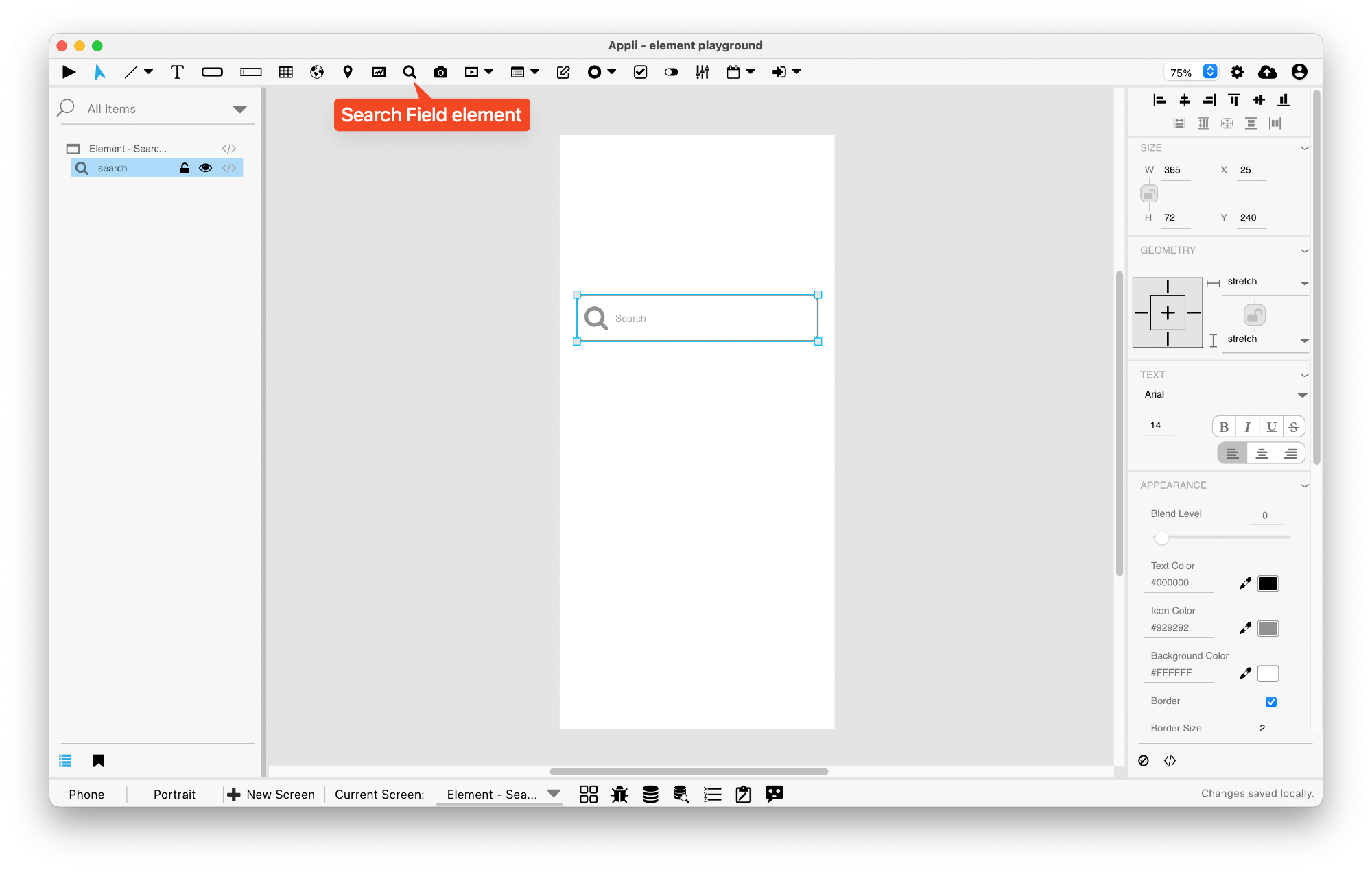
Size Section
This section is used to configure the search-field size and position.
| Property | Description |
|---|---|
| top | The value in pixels representing how far the element is from the top of the window. |
| left | The value in pixels representing how distant element is from the left side of the window. |
| width | The value in pixels representing the distance between the left side of the element and its right side. |
| height | The value in pixels representing the distance between the bottom side of the element and its top side. |
Geometry Section
Use the properties in this section to configure the responsive design behaviors for the element.
| Property | Description |
|---|---|
| lockAspectRatio | Locks the aspect ratio of the element. |
| responsiveX | how the element resizes responding to screen changes in the X axis. |
| responsiveY | how the element resizes responding to screen changes in the Y axis. |
| allowUnderNotch | Stretch to fill notch |
Text Section
The properties in this section are used together with those in the appearance section to configure how the element is displayed on the screen. This section deals with the properties related to text used by the search-field.
| Property | Description |
|---|---|
| textFace | The font used in the element’s text. |
| textSize | The text size used in the element’s text. |
| textStyle | The style used in the element’s text. It can be bold, italic, underlined, and strikethrough. |
| textAlign | The text alignment used for the element’s text. It can be aligned to the left, right, or center. |
Appearance Section
This section is used to configure how the search-field looks.
| Property | Description |
|---|---|
| blendLevel | How transparent the element is. |
| textColor | the color of the text in the element. |
| iconColor | the color of the icon. |
| backgroundColor | The color used for the element’s background. |
| showBorder | Turns the visibility of the element’s borders on or off. |
| lineSize | the size of a line in pixels. |
| lineColor | the color of the line. |
| showLabel1 | for elements with more than one label, this toggles the visibility of the first label. |
| label1Color | for elements with more than one label, this specifies the color for the first label. |
| showLabel2 | for elements with more than one label, this toggles the visibility of the second label. |
| label2Color | for elements with more than one label, this specifies the color for the second label. |
Element Section
This section is contains properties that are specific to elements of type search-field.
| Property | Description |
|---|---|
| name | The name of the element. Displayed in the project browser. |
| label1 | for elements with more than one label, this specifies the content for the first label. |
| label2 | for elements with more than one label, this specifies the content for the second label. |
| iconPlacement | how the icon should be placed inside the element. |
| lowCode | ActionScript that controls the behavior of the element. |
This chapter was last updated on Mon 5 Jan 2026 19:58:55 GMT