Element: Badge
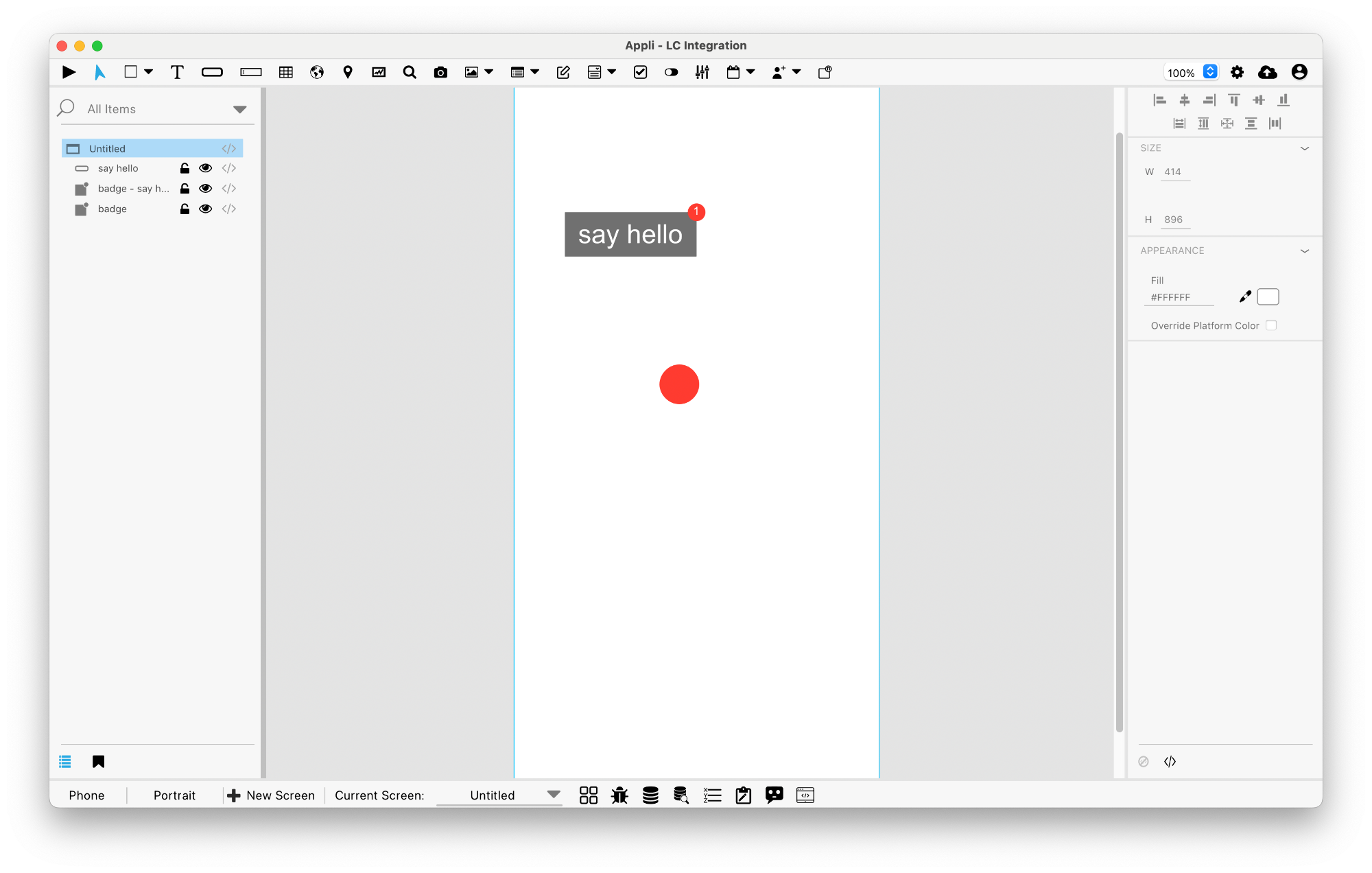
This element is a notification or status badge. It can be attached to other elements by clicking on the element, or created as a standalone element. The badge can have text, numbers, icons, or nothing inside of it. It can be connected to a variable so that it is updated whenever the screen is changed.
Events
Switches have a mouse related events that can be configured using low-code.
No Code
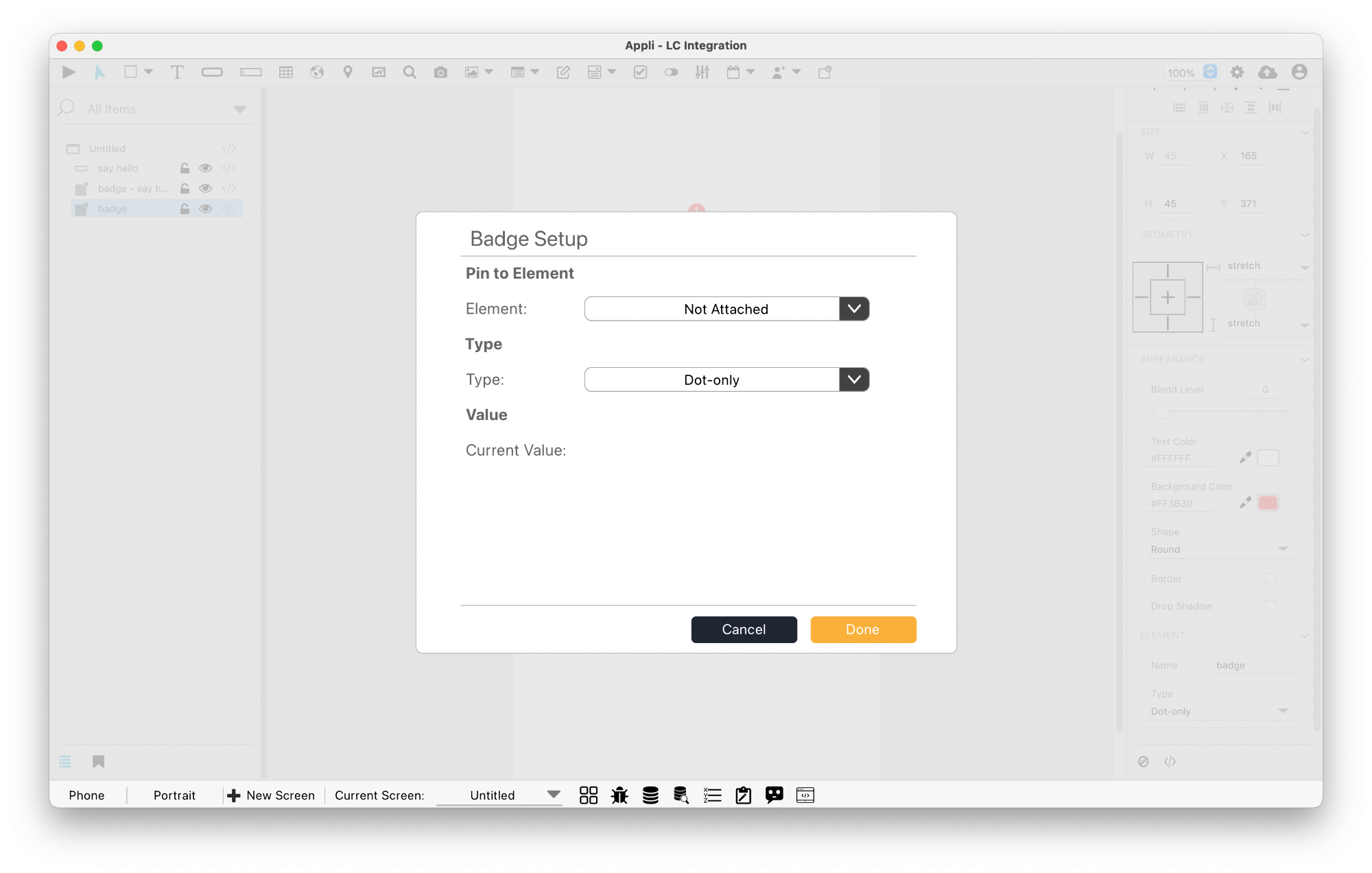
Badges can be pinned to elements and have different visual presentations. Both can be configured using the no code interface.
You can also pin badges to elements by clicking the badge element in the toolbar and then clicking the element you want to pin the badge to.
Actions
Badges have their own action category. Learn more about them here.
Properties
Size Section
This section is used to configure the badge size and position.
| Property | Description |
|---|---|
| width | The value in pixels representing the distance between the left side of the element and its right side. |
| left | The value in pixels representing how distant element is from the left side of the window. |
| height | The value in pixels representing the distance between the bottom side of the element and its top side. |
| top | The value in pixels representing how far the element is from the top of the window. |
Appearance Section
This section is used to configure how the badge looks.
| Property | Description |
|---|---|
| blendLevel | How transparent the element is. |
| textColor | the color of the text in the element. |
| backgroundColor | The color used for the element’s background. |
| shape | sets the shape of the element. |
| showBorder | Turns the visibility of the element’s borders on or off. |
| borderWidth | Border Size |
| borderColor | the color used for the border of the element. |
| dropShadow | The drop shadow for the element. |
| dropShadowColor | Color of the drop shadow. |
| dropShadowSize | Size of the drop shadow. |
| dropShadowDistance | Distance for the drop shadow. |
| dropShadowAngle | Angle for the drop shadow. |
Element Section
This section is contains properties that are specific to elements of type badge.
| Property | Description |
|---|---|
| name | The name of the element. Displayed in the project browser. |
| pinToElement | sets the pinToElement of the element. |
| variable | sets the variable of the element. |
| Anchor | sets the Anchor of the element. |
| Type | sets the Type of the element. |
| textValue | Value |
| NumericValue | Value |
| maxValue | Maximum Value |
| useAbbreviations | Use Abbreviations |
| autoHide | Auto Hide |
| decimalPlaces | Decimal Places |
| Icon | sets the Icon of the element. |
Geometry Section
Use the properties in this section to configure the responsive design behaviors for the element.
| Property | Description |
|---|---|
| responsive | sets if the element size should be responsive. |
| responsiveX | how the element resizes responding to screen changes in the X axis. |
| responsiveY | how the element resizes responding to screen changes in the Y axis. |
| lockResponsiveAspectRatio | Locks the aspect ratio of the element. |
This chapter was last updated on Fri 8 May 2026 15:20:15 BST