Tools palette

The tools palette can be understood as serving three different broad roles:
- At the right side, we have project management tools.
- Most of the buttons in the center of the palette are elements used to construct the application.
- The first button in the palette is a play tool used toggle between interacting or designing the app.
Project management
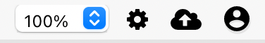
These buttons deal with workflows related to your project and your Appli account.
The gear button opens the application-wide settings. Use it to change the app name, icon, and some other general settings. Read the application settings documentation for more details.
The cloud button saves your application to the cloud.
The last user button is actually a dropdown navigation menu with multiple features. It can be used to sign out of Appli; go back to the project selection screen; and view the most recent patch notes.
Testing the app
The first button on the toolbar, the one that looks like a play button places Appli IDE in interaction mode. It disables both the left and right panes and lets the developer interact with the application as if it was running inside the player. To switch back to design mode, click it again.
Elements
Most of the rest of the palette is dedicated to hosting the elements used for app designing.

To draw an element in the playground, first select it on the tools palette and then draw it.
The pointer tool, which is the button next to the play button, can select and alter elements already on the playground.
Check out the elements gallery to learn more about each element.
This chapter was last updated on Mon 11 Sep 2023 18:56:03 BST