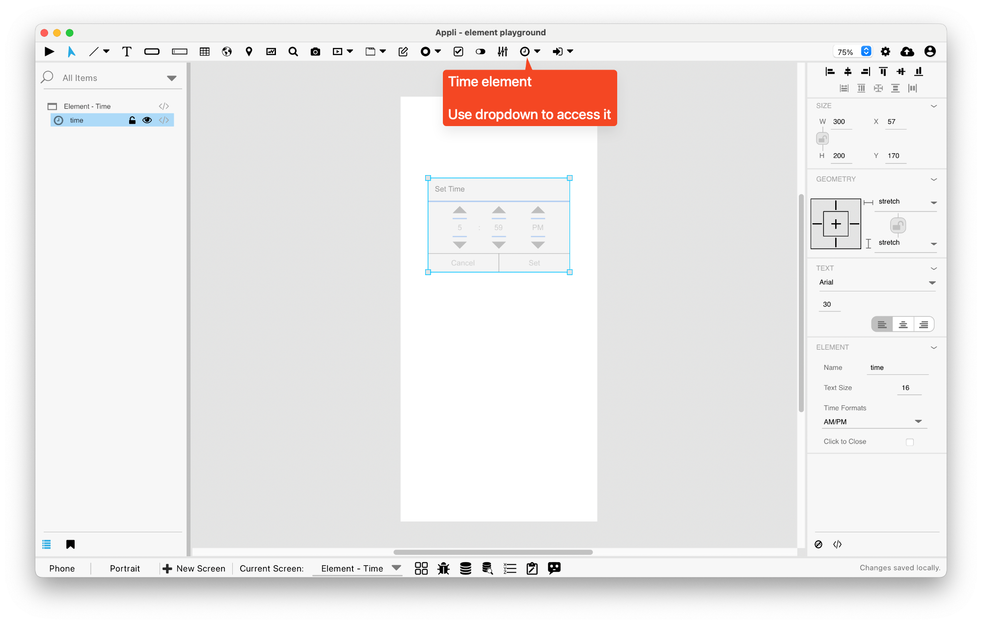
Element: Time
This element allows the user to display or pick a time. Use the property inspector in the playground to configure your time picker and use the date/time actions to show and hide them.
Events
Time elements have a mouseUp event that can be configured using low-code.
Properties
Size Section
This section is used to configure the time size and position.
| Property | Description |
|---|---|
| width | The value in pixels representing the distance between the left side of the element and its right side. |
| left | The value in pixels representing how distant element is from the left side of the window. |
| height | The value in pixels representing the distance between the bottom side of the element and its top side. |
| top | The value in pixels representing how far the element is from the top of the window. |
| lockAspectRatio | Locks the aspect ratio of the element. |
Geometry Section
Use the properties in this section to configure the responsive design behaviors for the element.
| Property | Description |
|---|---|
| responsive | sets if the element size should be responsive. |
| responsiveX | how the element resizes responding to screen changes in the X axis. |
| responsiveY | how the element resizes responding to screen changes in the Y axis. |
| lockResponsiveAspectRatio | Locks the aspect ratio of the element. |
| allowUnderNotch | Stretch to fill notch |
Element Section
This section is contains properties that are specific to elements of type time.
| Property | Description |
|---|---|
| name | The name of the element. Displayed in the project browser. |
| textSize | The text size used in the element’s text. |
| timeFormats | Time Formats |
| closeBg | Click to Close |
Text Section
The properties in this section are used together with those in the appearance section to configure how the element is displayed on the screen. This section deals with the properties related to text used by the time.
| Property | Description |
|---|---|
| textSize | The text size used in the element’s text. |
| textFont | The font used in the element’s text. |
| textAlign | The text alignment used for the element’s text. It can be aligned to the left, right, or center. |
This chapter was last updated on Fri 8 May 2026 15:20:15 BST