Element: Table
This element contains a table of records. Tables can be used to
display and edit records. The canEditData property
configures if the table is read-only or not.
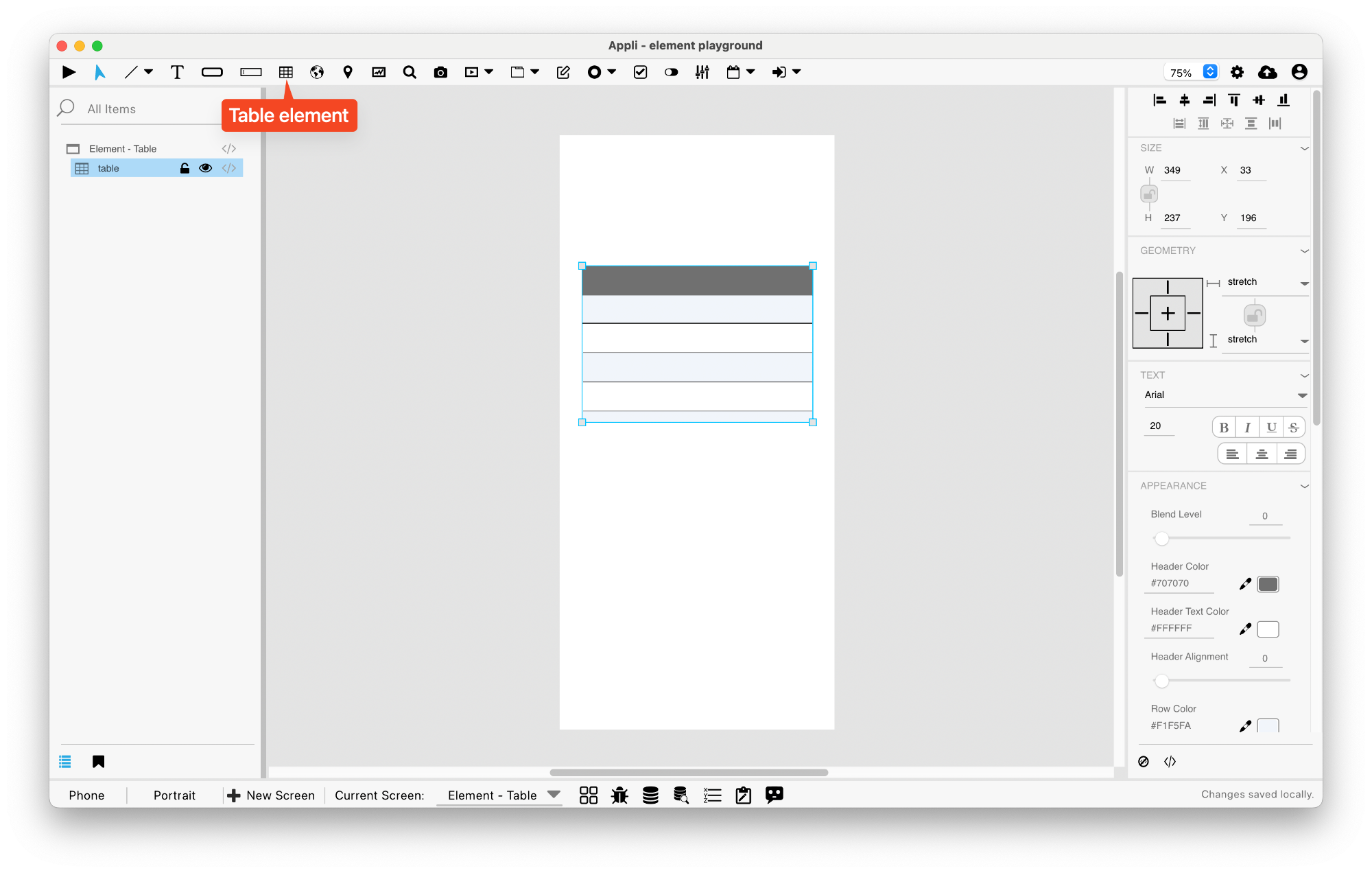
Table Setup
Use no-code to configure the table. Tables can be local, cloud, of hybrid. Using the no-code select which table and keys should be displayed on the table.
Actions
These are the low code actions available for table elements.
Refresh the Table
Used to refresh the records of a table element.
Example: after changing the records in a database, you can use this action to update the elements inside the table to reflect the current database state.
Count Displayed Records
Counts the amount of records in the table and place that value in a variable or another element.
Events
Tab menus have a mouseUp event that can be configured using low-code. This event is triggered when the user changes the selected tab.
Properties
Text Section
The properties in this section are used together with those in the appearance section to configure how the element is displayed on the screen. This section deals with the properties related to text used by the table.
| Property | Description |
|---|---|
| textSize | The text size used in the element’s text. |
| textFont | The font used in the element’s text. |
| textAlign | The text alignment used for the element’s text. It can be aligned to the left, right, or center. |
| textStyle | The style used in the element’s text. It can be bold, italic, underlined, and strikethrough. |
Geometry Section
Use the properties in this section to configure the responsive design behaviors for the element.
| Property | Description |
|---|---|
| responsive | sets if the element size should be responsive. |
| responsiveX | how the element resizes responding to screen changes in the X axis. |
| responsiveY | how the element resizes responding to screen changes in the Y axis. |
| lockResponsiveAspectRatio | Locks the aspect ratio of the element. |
| allowUnderNotch | Stretch to fill notch |
Size Section
This section is used to configure the table size and position.
| Property | Description |
|---|---|
| width | The value in pixels representing the distance between the left side of the element and its right side. |
| left | The value in pixels representing how distant element is from the left side of the window. |
| height | The value in pixels representing the distance between the bottom side of the element and its top side. |
| top | The value in pixels representing how far the element is from the top of the window. |
| lockAspectRatio | Locks the aspect ratio of the element. |
Appearance Section
This section is used to configure how the table looks.
| Property | Description |
|---|---|
| blendLevel | How transparent the element is. |
| headerColor | the color used by the header background. |
| headerTextColor | the color used by the header text. |
| headerVerticalAlign | the vertical alignment of the header. |
| rowColor1 | For elements with alternating row colors, this is the color for the odd rows. |
| rowColor2 | For elements with alternating row colors, this is the color for the even rows. |
| textHeight | the line height in pixels. |
| rowVerticalAlign | the vertical alignment for the row. |
| bodyTextColor | the color used by the body text. |
| columnAlign | the alignment for the column. |
| showBorder | Turns the visibility of the element’s borders on or off. |
| lineColor | the color of the line. |
| hiliteColor | The color of the hilited state of the element. |
| useRowColorForEditCell | if the element should use the row color for the edit cell background. |
| editCellColor | Editing Cell Color |
| editCellTextColor | the color used by the text inside an edit cell. |
| editCellHiliteColor | the hilite color used by edit cells. |
Element Section
This section is contains properties that are specific to elements of type table.
| Property | Description |
|---|---|
| name | The name of the element. Displayed in the project browser. |
| canEditData | if the data shown in the element is editable. |
| adjustColumnsOnPlayer | if the columns should be adjusted depending on the player size. |
This chapter was last updated on Fri 8 May 2026 15:20:15 BST