Overview of Appli Builder Interface
Welcome to the primary interface of Appli Builder. This is where you’ll spend most of your time as a developer working on your next awesome project. This section will help you become familiar with the various features and workflows inside the playground which is the screen you use to design your application.
The playground screen is divided into five regions: tools palette, left pane, playground, property inspector, and footer. In the next sections, we’ll provide a high-level overview of each of these regions with links to dive deeper into each of them.
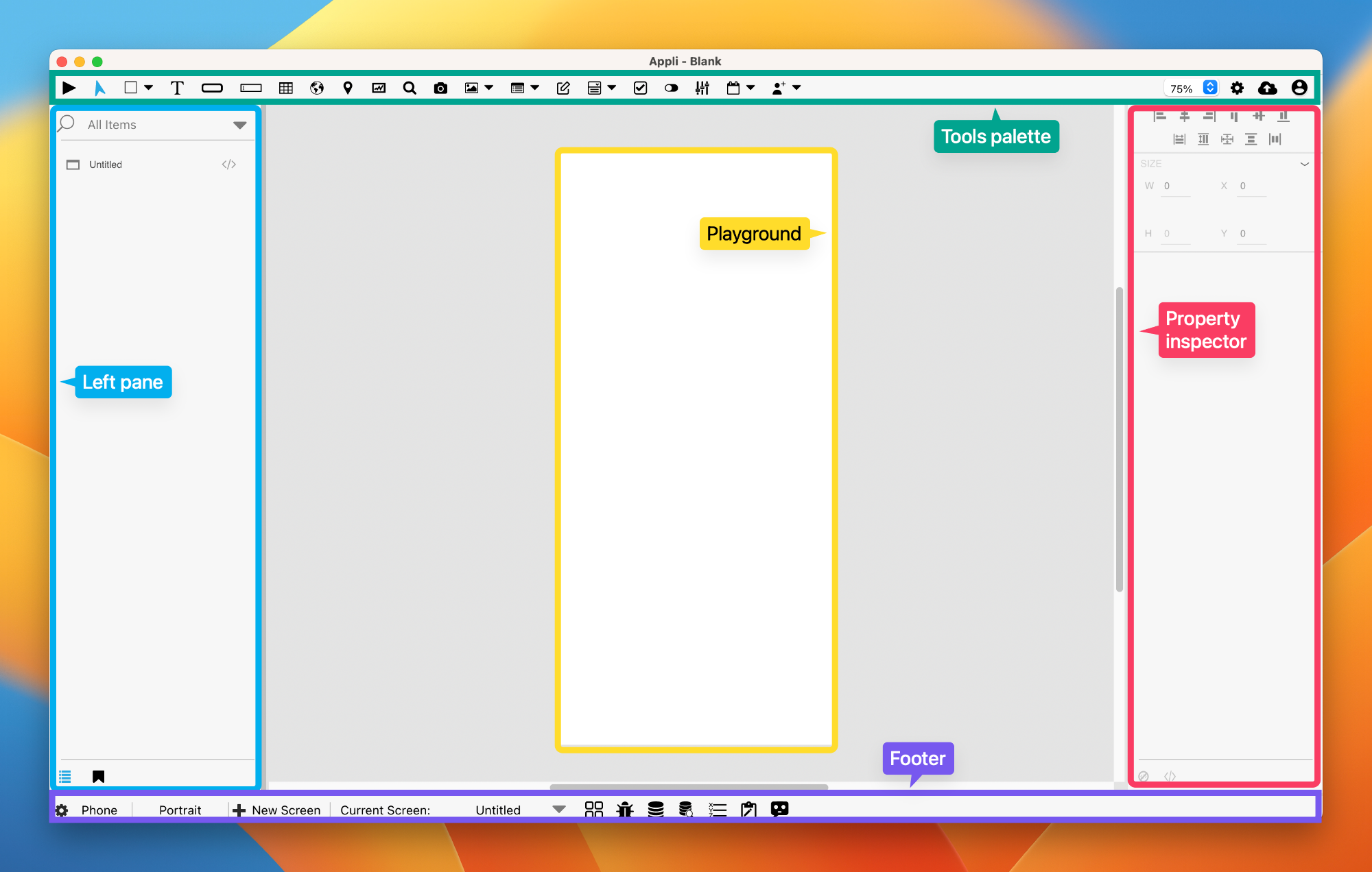
Tools Palette
The tools palette on the top of the interface holds the elements that the developer uses to build their own application. To add an element to the playground, first select the element, and then use the mouse to create it by clicking and dragging a rectangle that represents its dimensions on the playground.
On the right side of the tools palette is a collection of buttons to enable to you to:
- Save your project on the cloud.
- Change application-wide settings.
- Handle workflow related tasks such as signing out, going back to the home screen,.
To learn more about which elements are available for you, check out the elements gallery.
Check out the Tools Palette documentation to learn more about the tools palette itself.
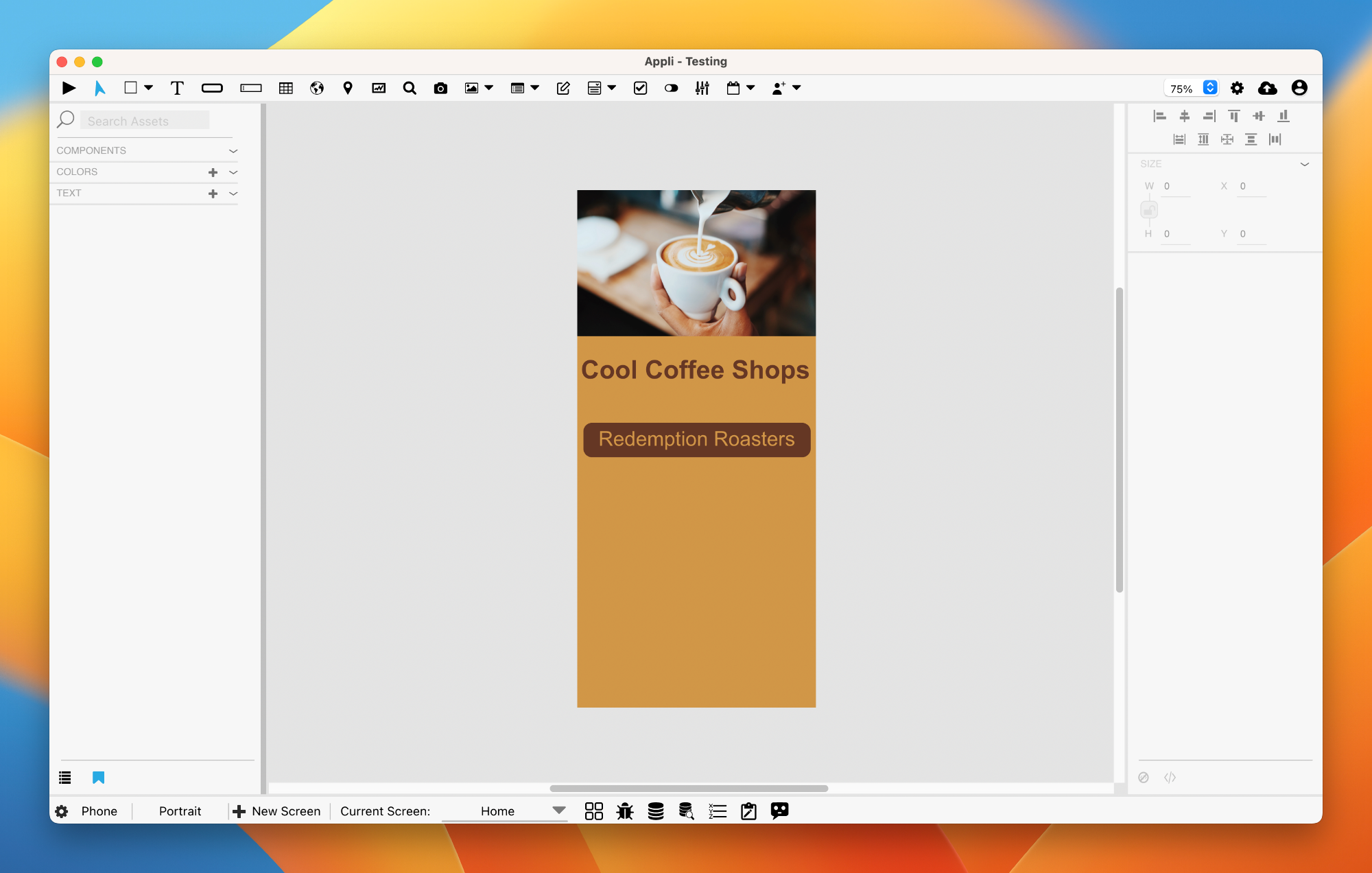
Playground
The playground is the most important region in the Appli IDE interface, which is why we call this screen the playground screen. This is the canvas in which the developer will build their application.
The Left Pane
The left side of the IDE hosts two important tools: the project browser and the asset manager. To switch between them, use the buttons at the bottom of the pane. The first button switches to the project browser, the second selects the asset manager.
Project Browser
The project browser lists all the elements on the current screen as a hierarchical list. Some elements are containers. In such cases, the elements they contain will appear under them on the list.
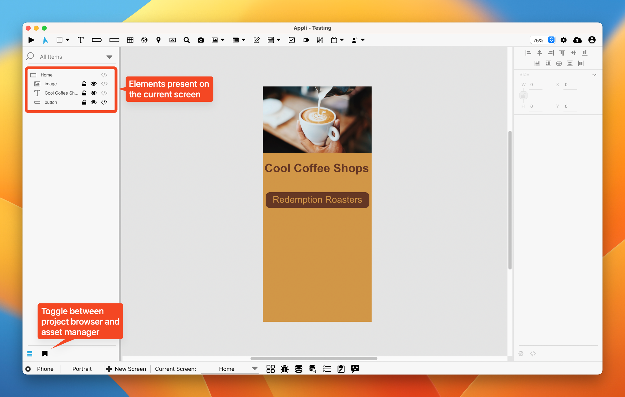
A search box is provided in case you need to filter the list of elements. For each element on the list, you can:
- Use the padlock button to lock the element and prevent accidental changes to its properties.
- Use the eye button to toggle the visibility of the element.
- Use the brackets button to change the low-code/no-code flow for the element.
Asset Manager
Use the asset manager to define a theme for your application. You can select default colors and text styles that will apply to all elements in the app.
To learn more about this feature, check out the asset manager documentation.
Property Inspector
On the right side of the IDE, you’ll find the property inspector. Elements are configurable via properties. You can change various characteristics and features by changing values in the property inspector. It is through the property inspector that the developer can change the behavior of an element, something that you can learn more by diving deeper into the property inspector.
Footer
The footer is at the bottom of the interface. In that region are many useful tools to manage plataforms, screens, data, variables, and even get help from our AI.
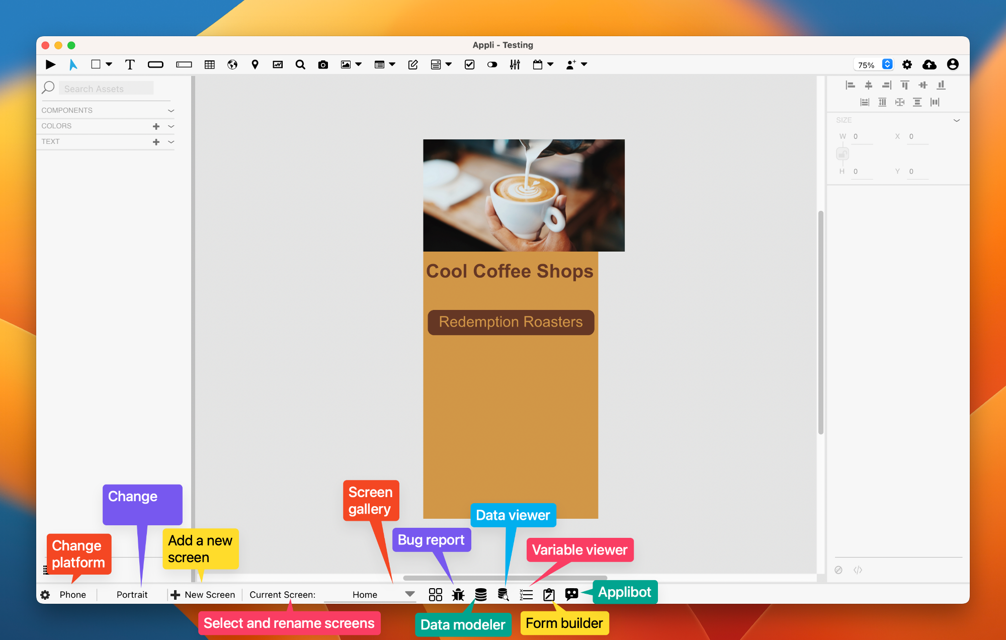
Read the Footer documentation to learn more about the various tools.
This chapter was last updated on Mon 11 Sep 2023 18:49:43 BST