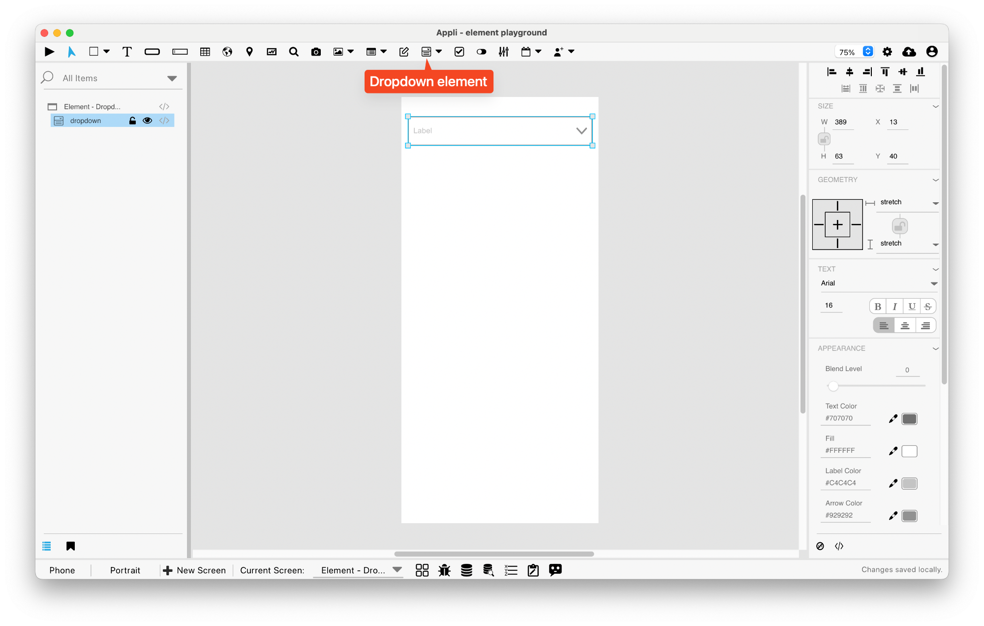
Element: Dropdown
This element holds a menu. Clicking the element causes a scrolling list of options to open. Selecting an item will close back the dropdown menu.
Events
Dropdowns have a mouseUp event that can be configured using low-code. This event is triggered when the user selects one of the available options.
Low code
When changing the options property of a dropdown menu
using lowcode, you must use double pipes || to seperate the
label of the option and the value of the option.
LABEL 1||VALUE 1
LABEL 2||VALUE 2
If the value of an option is empty, the label is also used as the value. You must use the Refresh Dropdown function to update the changes.
Properties
Text Section
The properties in this section are used together with those in the appearance section to configure how the element is displayed on the screen. This section deals with the properties related to text used by the dropdown.
| Property | Description |
|---|---|
| textSize | The text size used in the element’s text. |
| textFont | The font used in the element’s text. |
| textAlign | The text alignment used for the element’s text. It can be aligned to the left, right, or center. |
| textStyle | The style used in the element’s text. It can be bold, italic, underlined, and strikethrough. |
Geometry Section
Use the properties in this section to configure the responsive design behaviors for the element.
| Property | Description |
|---|---|
| responsive | sets if the element size should be responsive. |
| responsiveX | how the element resizes responding to screen changes in the X axis. |
| responsiveY | how the element resizes responding to screen changes in the Y axis. |
| lockResponsiveAspectRatio | Locks the aspect ratio of the element. |
| allowUnderNotch | Stretch to fill notch |
Size Section
This section is used to configure the dropdown size and position.
| Property | Description |
|---|---|
| width | The value in pixels representing the distance between the left side of the element and its right side. |
| left | The value in pixels representing how distant element is from the left side of the window. |
| height | The value in pixels representing the distance between the bottom side of the element and its top side. |
| top | The value in pixels representing how far the element is from the top of the window. |
| lockAspectRatio | Locks the aspect ratio of the element. |
Appearance Section
This section is used to configure how the dropdown looks.
| Property | Description |
|---|---|
| blendLevel | How transparent the element is. |
| foregroundColor | The color used in text. |
| backgroundColor | The color used for the element’s background. |
| labelColor | The color used for the text in the label of the element. |
| arrowColor | The color used for the arrow inside the element. |
| roundRadius | How round the corners of the element are. |
| showBorder | Turns the visibility of the element’s borders on or off. |
| lineSize | the size of a line in pixels. |
| borderColor | the color used for the border of the element. |
Element Section
This section is contains properties that are specific to elements of type dropdown.
| Property | Description |
|---|---|
| name | The name of the element. Displayed in the project browser. |
| label | The text label for the element. |
| options | A list of options used by the element. |
| numOfOptionsToDisplay | How many options to display. |
This chapter was last updated on Fri 8 May 2026 15:20:15 BST