Element: Report
This element contains a report.
Be aware that a layout element is empty when first drawn on the screen. You need to place the elements you want inside it.
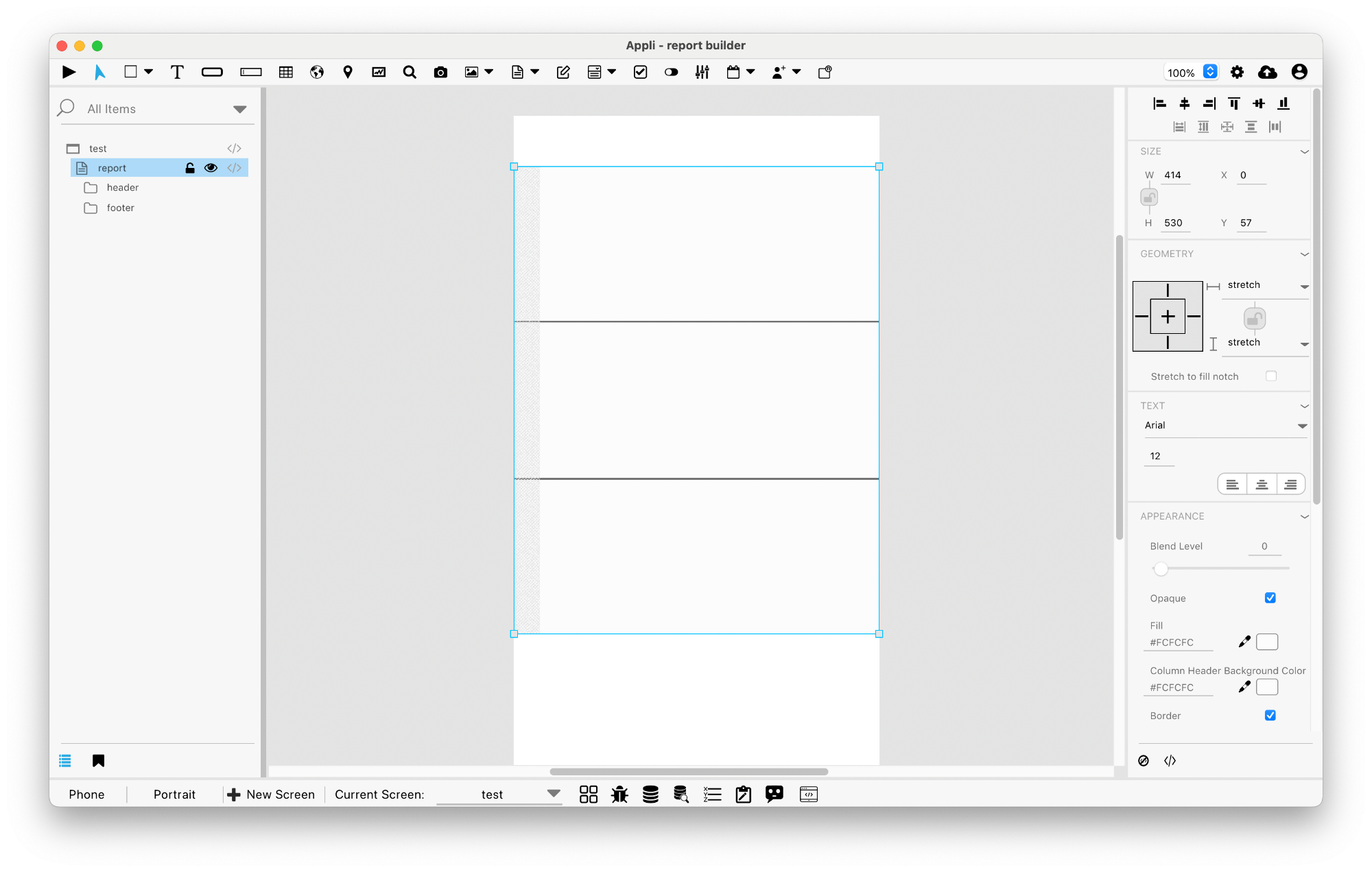
A report element is a container element that by default contains two groups inside it: header and footer. A report is composed of a header, the report, and a footer.
No code
There necessary options available for Report elements that must be configured using no code.
Events
Maps have a mouseUp event that can be configured using low-code. This event is triggered when the user clicks or touches the map.
Actions
There are the low code actions available for Report elements. Check the Actions: Report documentation for more information.
Properties
Text Section
The properties in this section are used together with those in the appearance section to configure how the element is displayed on the screen. This section deals with the properties related to text used by the report.
| Property | Description |
|---|---|
| textSize | The text size used in the element’s text. |
| textFont | The font used in the element’s text. |
| textAlign | The text alignment used for the element’s text. It can be aligned to the left, right, or center. |
Geometry Section
Use the properties in this section to configure the responsive design behaviors for the element.
| Property | Description |
|---|---|
| responsive | sets if the element size should be responsive. |
| responsiveX | how the element resizes responding to screen changes in the X axis. |
| responsiveY | how the element resizes responding to screen changes in the Y axis. |
| lockResponsiveAspectRatio | Locks the aspect ratio of the element. |
| allowUnderNotch | Stretch to fill notch |
Size Section
This section is used to configure the report size and position.
| Property | Description |
|---|---|
| width | The value in pixels representing the distance between the left side of the element and its right side. |
| left | The value in pixels representing how distant element is from the left side of the window. |
| height | The value in pixels representing the distance between the bottom side of the element and its top side. |
| top | The value in pixels representing how far the element is from the top of the window. |
| lockAspectRatio | Locks the aspect ratio of the element. |
Appearance Section
This section is used to configure how the report looks.
| Property | Description |
|---|---|
| blendLevel | How transparent the element is. |
| opaque | if the element is opaque or if it’s background is transparent. |
| backgroundColor | The color used for the element’s background. |
| columnHeaderBackgroundColor | Column Header Background Color |
| showBorder | Turns the visibility of the element’s borders on or off. |
| lineSize | the size of a line in pixels. |
| borderColor | the color used for the border of the element. |
| showCellLines | Cell Lines |
| cellLineSize | Cell Line Size |
| cellLineColor | Cell Line Color |
Element Section
This section is contains properties that are specific to elements of type report.
| Property | Description |
|---|---|
| name | The name of the element. Displayed in the project browser. |
| showHeader | Header |
| showFooter | Footer |
| showLineNumberColumn | Line Number Column |
| lineNumberColumnName | Column Name |
This chapter was last updated on Fri 8 May 2026 15:20:15 BST