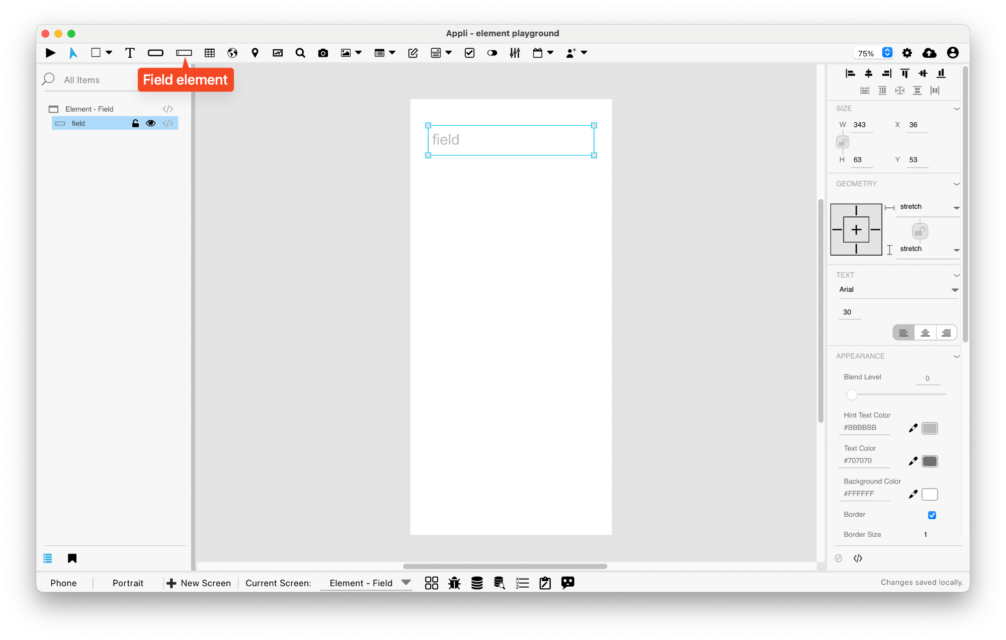
Element: Field
This element allows the user to enter or edit text.
Events
Fields have a mouseUp event that can be configured using low-code. This event is triggered when the user clicks or touches the field.
Properties
Text Section
The properties in this section are used together with those in the appearance section to configure how the element is displayed on the screen. This section deals with the properties related to text used by the field.
| Property | Description |
|---|---|
| textSize | The text size used in the element’s text. |
| textFont | The font used in the element’s text. |
| textAlign | The text alignment used for the element’s text. It can be aligned to the left, right, or center. |
Geometry Section
Use the properties in this section to configure the responsive design behaviors for the element.
| Property | Description |
|---|---|
| responsive | sets if the element size should be responsive. |
| responsiveX | how the element resizes responding to screen changes in the X axis. |
| responsiveY | how the element resizes responding to screen changes in the Y axis. |
| lockResponsiveAspectRatio | Locks the aspect ratio of the element. |
| allowUnderNotch | Stretch to fill notch |
Size Section
This section is used to configure the field size and position.
| Property | Description |
|---|---|
| width | The value in pixels representing the distance between the left side of the element and its right side. |
| left | The value in pixels representing how distant element is from the left side of the window. |
| height | The value in pixels representing the distance between the bottom side of the element and its top side. |
| top | The value in pixels representing how far the element is from the top of the window. |
| lockAspectRatio | Locks the aspect ratio of the element. |
Appearance Section
This section is used to configure how the field looks.
| Property | Description |
|---|---|
| blendLevel | How transparent the element is. |
| hintTextColor | the color used by the hint text. |
| textColor | the color of the text in the element. |
| backgroundColor | The color used for the element’s background. |
| showBorder | Turns the visibility of the element’s borders on or off. |
| lineSize | the size of a line in pixels. |
| borderColor | the color used for the border of the element. |
Element Section
This section is contains properties that are specific to elements of type field.
| Property | Description |
|---|---|
| name | The name of the element. Displayed in the project browser. |
| hintText | the hint text. |
| lockedText | Lock Text (prevents modification). |
| useNativeiOS | Use Native on iOS |
| useNativeAndroid | Use Native on Android |
| multiLine | Configures the text field to accept multiline text instead of single line input. |
| validationType | Configures validation type. |
| passwordField | marks the field as a password entry. This masks the input so that it is not readable. |
| keyboardType | configure what kind of keyboard is to be used when entering data in the element. |
| autoCorrectionType | configures if the element should use auto-correction features. |
| autoCapitalizationType | configures if the element should use auto-capitalize it’s data. |
This chapter was last updated on Fri 8 May 2026 15:20:15 BST