Element: Layout
This element collects other elements as a group.
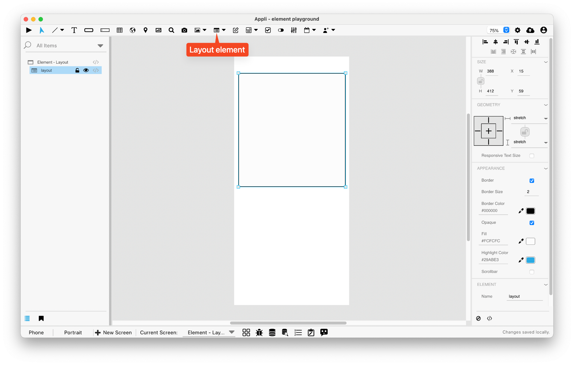
Be aware that a layout element is empty when first drawn on the screen. You need to place the elements you want inside it.
No code
There are extra options available for Layout elements that can be configured using no code.
One can use records on a database to configure the elements inside a Layout.
Actions
These are the low code actions available for Layout elements.
Refresh the layout
Used to refresh the records of a Layout element.
Example: after changing the records in a database, you can use this action to update the elements inside the Layout to reflect the current database state.
Set variable from Context
Each element inside a Layout has a Context (i.e. a reference to the RecordID). Using this action, one can update a variable based on a value from that context.
Events
Layouts have a mouseUp event that can be configured using low-code. This event is triggered when the user clicks or touches the layout.
Properties
Size Section
This section is used to configure the layout size and position.
| Property | Description |
|---|---|
| width | The value in pixels representing the distance between the left side of the element and its right side. |
| left | The value in pixels representing how distant element is from the left side of the window. |
| height | The value in pixels representing the distance between the bottom side of the element and its top side. |
| top | The value in pixels representing how far the element is from the top of the window. |
| lockAspectRatio | Locks the aspect ratio of the element. |
Appearance Section
This section is used to configure how the layout looks.
| Property | Description |
|---|---|
| showBorder | Turns the visibility of the element’s borders on or off. |
| lineSize | the size of a line in pixels. |
| borderColor | the color used for the border of the element. |
| opaque | if the element is opaque or if it’s background is transparent. |
| backgroundColor | The color used for the element’s background. |
| alternateRowColors | Alternate Row Colors |
| rowColor1 | For elements with alternating row colors, this is the color for the odd rows. |
| rowColor2 | For elements with alternating row colors, this is the color for the even rows. |
| rowHiliteColor | Highlight Color |
| showScrollbar | If the scrollbar should be visible or not. |
Element Section
This section is contains properties that are specific to elements of type layout.
| Property | Description |
|---|---|
| name | The name of the element. Displayed in the project browser. |
| multipleRows | If the element should contain multiple rows. |
| Columns | sets the Columns of the element. |
| rowHeight | the height for the row. |
| canHiliteRow | Highlight Row on Click |
| bottomMargin | the value in pixels of the bottom margin. |
| pullToRefresh | Pull to Refresh |
Geometry Section
Use the properties in this section to configure the responsive design behaviors for the element.
| Property | Description |
|---|---|
| responsive | sets if the element size should be responsive. |
| responsiveX | how the element resizes responding to screen changes in the X axis. |
| responsiveY | how the element resizes responding to screen changes in the Y axis. |
| lockResponsiveAspectRatio | Locks the aspect ratio of the element. |
| responsiveText | Responsive Text Size |
| allowUnderNotch | Stretch to fill notch |
This chapter was last updated on Fri 8 May 2026 15:20:15 BST