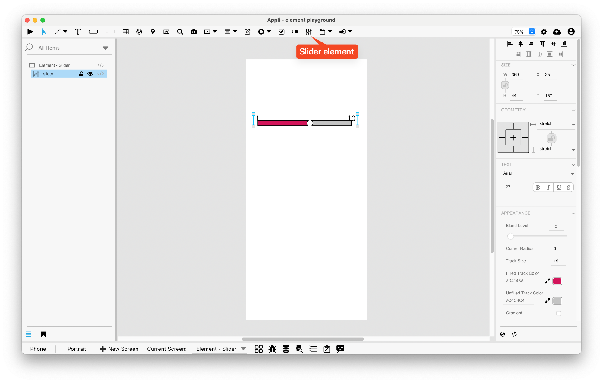
Element: Slider
This element allows the user to enter a value in a range. It shows a slider from minimum to maximum value.
Events
Sliders have a mouse and touch related events that can be configured
using low-code. They also have a sliderValueChanged event
that is triggered when the value changes.
Properties
Text Section
The properties in this section are used together with those in the appearance section to configure how the element is displayed on the screen. This section deals with the properties related to text used by the slider.
| Property | Description |
|---|---|
| textSize | The text size used in the element’s text. |
| textFont | The font used in the element’s text. |
| textStyle | The style used in the element’s text. It can be bold, italic, underlined, and strikethrough. |
Geometry Section
Use the properties in this section to configure the responsive design behaviors for the element.
| Property | Description |
|---|---|
| responsive | sets if the element size should be responsive. |
| responsiveX | how the element resizes responding to screen changes in the X axis. |
| responsiveY | how the element resizes responding to screen changes in the Y axis. |
| lockResponsiveAspectRatio | Locks the aspect ratio of the element. |
| allowUnderNotch | Stretch to fill notch |
Size Section
This section is used to configure the slider size and position.
| Property | Description |
|---|---|
| width | The value in pixels representing the distance between the left side of the element and its right side. |
| left | The value in pixels representing how distant element is from the left side of the window. |
| height | The value in pixels representing the distance between the bottom side of the element and its top side. |
| top | The value in pixels representing how far the element is from the top of the window. |
| lockAspectRatio | Locks the aspect ratio of the element. |
Appearance Section
This section is used to configure how the slider looks.
| Property | Description |
|---|---|
| blendLevel | How transparent the element is. |
| roundRadius | How round the corners of the element are. |
| trackSize | Track Size |
| minTrackColor | Filled Track Color |
| maxTrackColor | Unfilled Track Color |
| gradient | Gradient |
| trackBorder | Track Border |
| trackBorderSize | Track Border Size |
| trackBorderColor | Track Border Color |
| showThumb | Show Thumb |
| thumbSize | Thumb Size |
| thumbColor | Thumb Color |
| thumbBorder | Thumb Border |
| thumbBorderSize | Thumb Border Size |
| thumbBorderColor | Thumb Border Color |
| showLabels | Show Labels |
| labelType | Label Type |
| labelPosition | Label Position |
| foregroundColor | The color used in text. |
| iconHeight | Icon Height |
| iconWidth | Icon Width |
| maintainAspectRatio | Maintain icon aspect ratio. |
| autoSize | Sets size to automatic |
Element Section
This section is contains properties that are specific to elements of type slider.
| Property | Description |
|---|---|
| name | The name of the element. Displayed in the project browser. |
| sliderOrientation | Slider Orientation |
| currentValue | Current Value |
| minValue | Minimum Value |
| maxValue | Maximum Value |
| minValueText | Min Value Text |
| maxValueText | Max Value Text |
| minValueIcon | Min Value Icon |
| maxValueIcon | Max Value Icon |
| step | Step Size |
| showIncrements | Show Increments |
This chapter was last updated on Fri 8 May 2026 15:20:15 BST