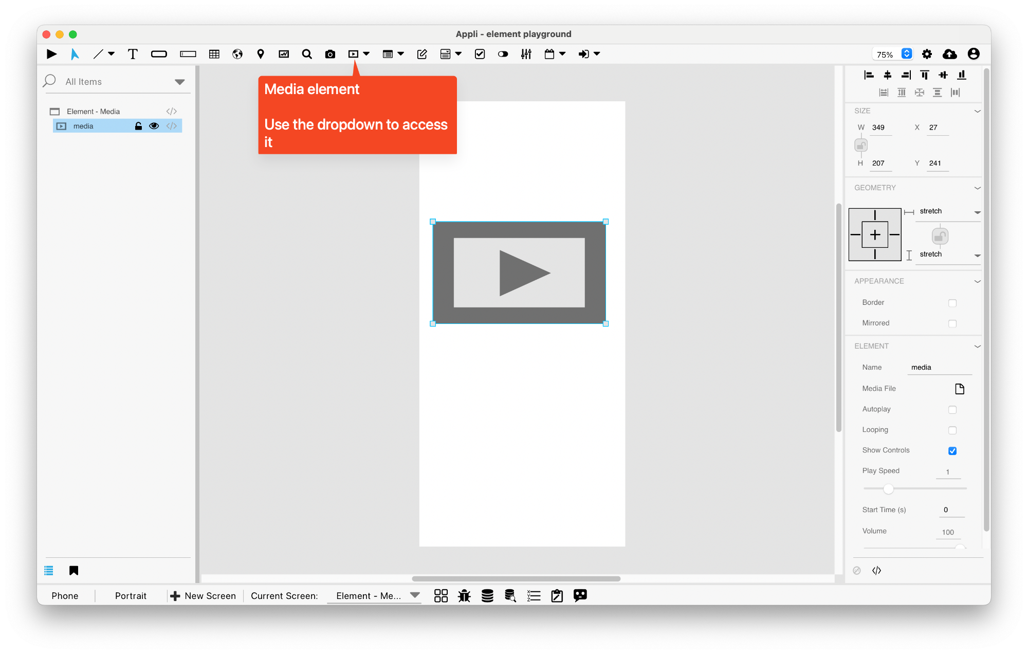
Element: Media
This element displays content from a media file.

Events
Media elements have a mouseUp event that can be configured using low-code. This event is triggered when the user clicks or touches the element.
Properties
Size Section
This section is used to configure the media size and position.
| Property | Description |
|---|---|
| top | The value in pixels representing how far the element is from the top of the window. |
| left | The value in pixels representing how distant element is from the left side of the window. |
| width | The value in pixels representing the distance between the left side of the element and its right side. |
| height | The value in pixels representing the distance between the bottom side of the element and its top side. |
Geometry Section
Use the properties in this section to configure the responsive design behaviors for the element.
| Property | Description |
|---|---|
| lockAspectRatio | Locks the aspect ratio of the element. |
| responsiveX | how the element resizes responding to screen changes in the X axis. |
| responsiveY | how the element resizes responding to screen changes in the Y axis. |
| allowUnderNotch | Stretch to fill notch |
Appearance Section
This section is used to configure how the media looks.
| Property | Description |
|---|---|
| showBorder | Turns the visibility of the element’s borders on or off. |
| mirrored | If the content of the element should be mirrored (flipped horizontally). |
Element Section
This section is contains properties that are specific to elements of type media.
| Property | Description |
|---|---|
| name | The name of the element. Displayed in the project browser. |
| mediaFile | The file used by the media element. |
| autoPlay | if the video should play automatically. |
| looping | if the video should restart automatically. |
| showController | if the video element should show user-accessible controls. |
This chapter was last updated on Mon 20 Apr 2026 20:21:01 BST