Element: Tab Menu
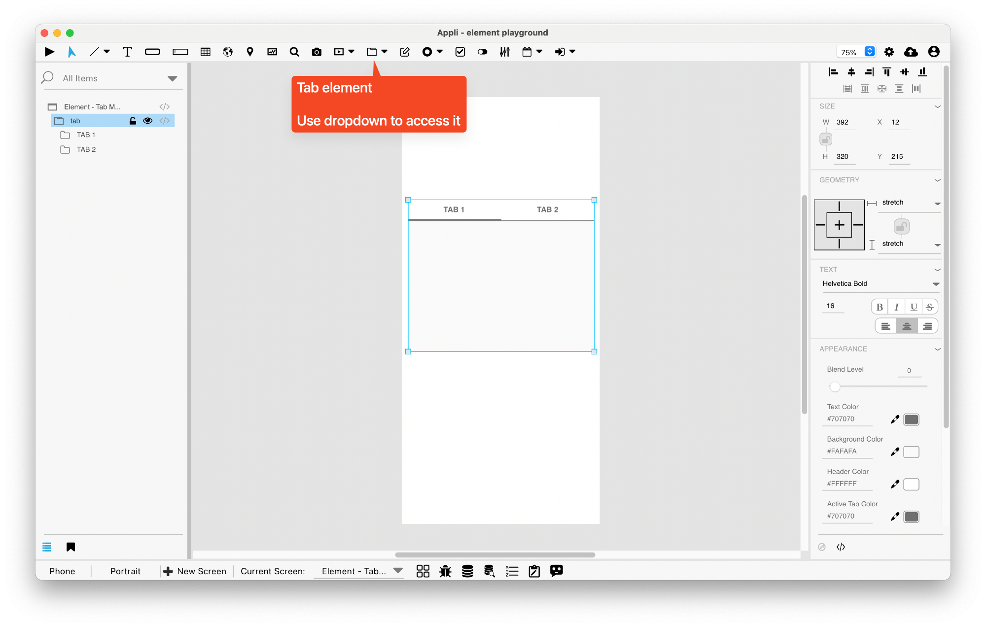
This element is a tab menu. It can contain multiple tabs each with their own collection of elements.
Each tab contains their own elements. To edit a specific tab,
double-click the tab you want to change or change the
selectedTab property using the property inspector. Then add
elements to it by dragging and dropping them on top of the tab.
To change a tab name, select the tab using the
selectedTab property and change the tabName
property. That property always display the name of the selected tab.
Events
Tab menus have a mouseUp event that can be configured using low-code. This event is triggered when the user changes the selected tab.
Properties
Text Section
The properties in this section are used together with those in the appearance section to configure how the element is displayed on the screen. This section deals with the properties related to text used by the tab.
| Property | Description |
|---|---|
| textSize | The text size used in the element’s text. |
| textFont | The font used in the element’s text. |
| textAlign | The text alignment used for the element’s text. It can be aligned to the left, right, or center. |
| textStyle | The style used in the element’s text. It can be bold, italic, underlined, and strikethrough. |
Geometry Section
Use the properties in this section to configure the responsive design behaviors for the element.
| Property | Description |
|---|---|
| responsive | sets if the element size should be responsive. |
| responsiveX | how the element resizes responding to screen changes in the X axis. |
| responsiveY | how the element resizes responding to screen changes in the Y axis. |
| lockResponsiveAspectRatio | Locks the aspect ratio of the element. |
| allowUnderNotch | Stretch to fill notch |
Size Section
This section is used to configure the tab size and position.
| Property | Description |
|---|---|
| width | The value in pixels representing the distance between the left side of the element and its right side. |
| left | The value in pixels representing how distant element is from the left side of the window. |
| height | The value in pixels representing the distance between the bottom side of the element and its top side. |
| top | The value in pixels representing how far the element is from the top of the window. |
| lockAspectRatio | Locks the aspect ratio of the element. |
Appearance Section
This section is used to configure how the tab looks.
| Property | Description |
|---|---|
| blendLevel | How transparent the element is. |
| headerTextColor | the color used by the header text. |
| bodyBackgroundColor | Background Color |
| headerBackgroundColor | Header background color. |
| activeTabColor | the color used to hilite which tab is selected. |
Element Section
This section is contains properties that are specific to elements of type tab.
| Property | Description |
|---|---|
| name | The name of the element. Displayed in the project browser. |
| tabs | Number of Tabs |
| selectedTab | which of tabs is the active tab. |
| selectedTabName | Name of selected tab. |
This chapter was last updated on Fri 8 May 2026 15:20:15 BST