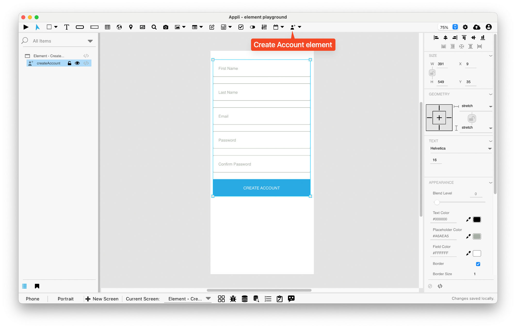
Element: Create Account
This element is a form that creates accounts. It has all the necessary fields and buttons for account creation already in place.
The fields are: first name, last name, email, password, and a password confirmation dialog. If your needs are different, you can roll your own form very easily.
User management in Appli
Every Appli project has its own database. Besides the tables created
by the developer, all projects have a cdbUser table that is
used to keep user accounts.
Use elements such as Create Account,
Login, and
the actions under the User Accounts
category to craft your own interface to handle user management
workflows.
The User Management Tutorial explores the topic in more depth and is recommended reading.
Events
Create account forms have a mouseUp event that can be configured using low-code. This event is triggered when the user clicks the Create Account button.
Properties
Text Section
The properties in this section are used together with those in the appearance section to configure how the element is displayed on the screen. This section deals with the properties related to text used by the createaccount.
| Property | Description |
|---|---|
| textSize | The text size used in the element’s text. |
| textFont | The font used in the element’s text. |
Geometry Section
Use the properties in this section to configure the responsive design behaviors for the element.
| Property | Description |
|---|---|
| responsive | sets if the element size should be responsive. |
| responsiveX | how the element resizes responding to screen changes in the X axis. |
| responsiveY | how the element resizes responding to screen changes in the Y axis. |
| lockResponsiveAspectRatio | Locks the aspect ratio of the element. |
| allowUnderNotch | Stretch to fill notch |
Size Section
This section is used to configure the createaccount size and position.
| Property | Description |
|---|---|
| width | The value in pixels representing the distance between the left side of the element and its right side. |
| left | The value in pixels representing how distant element is from the left side of the window. |
| height | The value in pixels representing the distance between the bottom side of the element and its top side. |
| top | The value in pixels representing how far the element is from the top of the window. |
| lockAspectRatio | Locks the aspect ratio of the element. |
Appearance Section
This section is used to configure how the createaccount looks.
| Property | Description |
|---|---|
| blendLevel | How transparent the element is. |
| foregroundColor | The color used in text. |
| placeholderColor | The color used for placeholder text. |
| backgroundColor | The color used for the element’s background. |
| fieldHeight | how tall the field is in pixels. |
| showBorder | Turns the visibility of the element’s borders on or off. |
| lineSize | the size of a line in pixels. |
| borderColor | the color used for the border of the element. |
| roundRadius | How round the corners of the element are. |
| buttonColor | the color for a button. |
| labelColor | The color used for the text in the label of the element. |
| buttonHeight | how tall is the button. |
| gap | the distance between various parts of an element. For example, in a field form it is the distance between fields. |
| autoSize | Sets size to automatic |
Element Section
This section is contains properties that are specific to elements of type createaccount.
| Property | Description |
|---|---|
| name | The name of the element. Displayed in the project browser. |
| sendVerificationEmail | Send Verification Email |
This chapter was last updated on Fri 8 May 2026 15:20:15 BST